CASE STUDY 03
Scaling Product Design in a Low-Code Environment
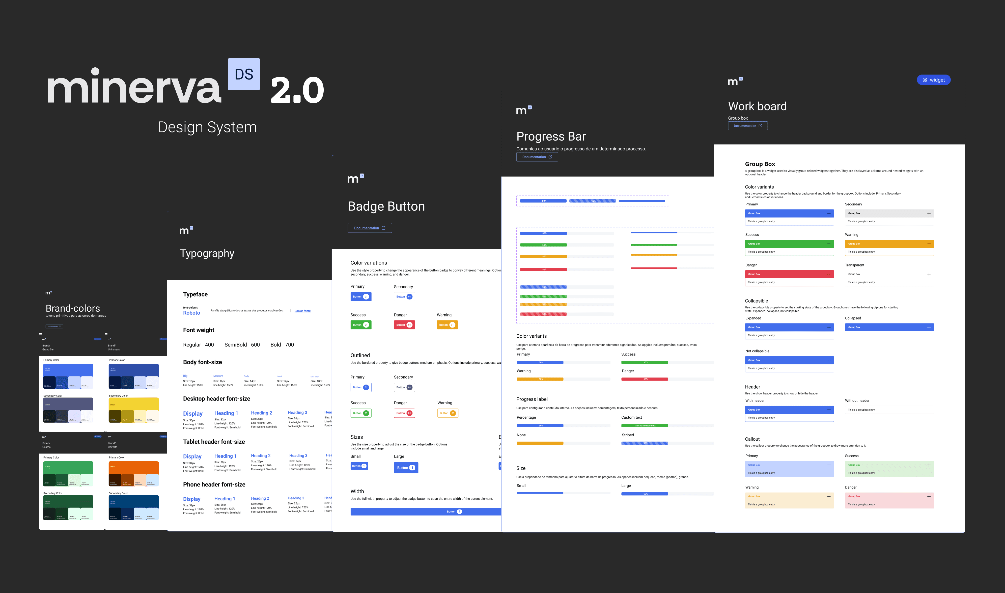
TrueChange builds digital products for different companies on a shared low-code platform. I led the creation of the Minerva Design System: reusable components and foundations aligned with the platform's constraints, now supporting 80+ products and the developers and designers who build them.
© 2026 Albertine Felipe
Problem
TrueChange builds digital products for different companies using a shared low-code platform. Although many of the same interface components were reused across projects, there was no design system to support designers. This meant components were often recreated from scratch, prototypes sometimes included elements that were difficult to implement quickly in low-code, and valuable time was lost during the design process.
My Role
As Product Designer, I initiated and led the creation of the Minerva Design System. I conducted a UI audit across existing products, mapped component needs collaboratively with the design team, defined the foundations, and built the component library aligned with the low-code platform's capabilities. A second designer partnered on documentation, variations, and consistency validation.
Outcome
The project resulted in a documented design system aligned with the low-code platform, adopted across 80+ products built by around 120 developers. As adoption grew, developers had fewer questions about component behavior and fewer implementation bugs. The system is now on v2.0, evolving collaboratively beyond its original scope.
The PROBLEM
Understanding the challenge
TrueChange develops products for different companies using the same low-code platform. While many interface patterns and components were repeatedly used across projects, there was no shared system to guide designers. As a result, components were often recreated from scratch, and prototypes sometimes included elements that were difficult to implement within the platform and prototypes sometimes included elements that were difficult to implement within the platform. In low-code, that gap is expensive: what the design proposes and what the platform can build are not the same thing by default.
This created unnecessary friction in the design process and made it harder to maintain consistency across products.
Product A
Product B
Product C
Shared Low-Code Platform
No Design System
Repeated Components
Inconsistent Interfaces
Slower Design Process
PROCESS
How we got there
Before defining the system itself, I reviewed 23+ products built on the platform to understand how interfaces were being designed in practice. Analyzing screens and flows across projects revealed the UI patterns designers were repeatedly recreating, and those patterns became the foundation of the Minerva design system.
Before designing components, I also studied the platform's native component library to understand what it offered and where its limits were. The direction was clear: prioritize native components, extend only where the platform genuinely fell short. Designing against the platform's real capabilities from the start eliminated rework later.
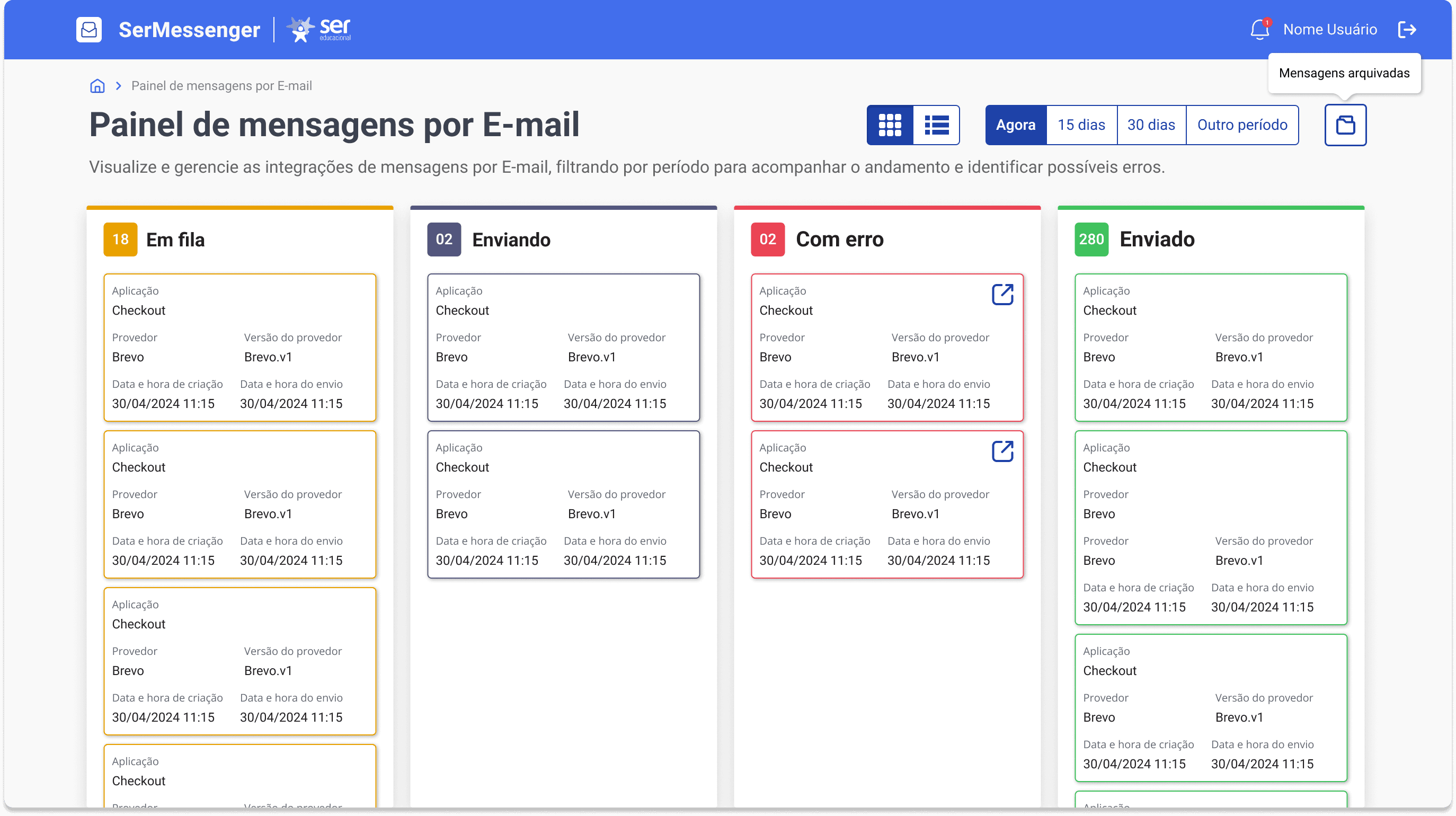
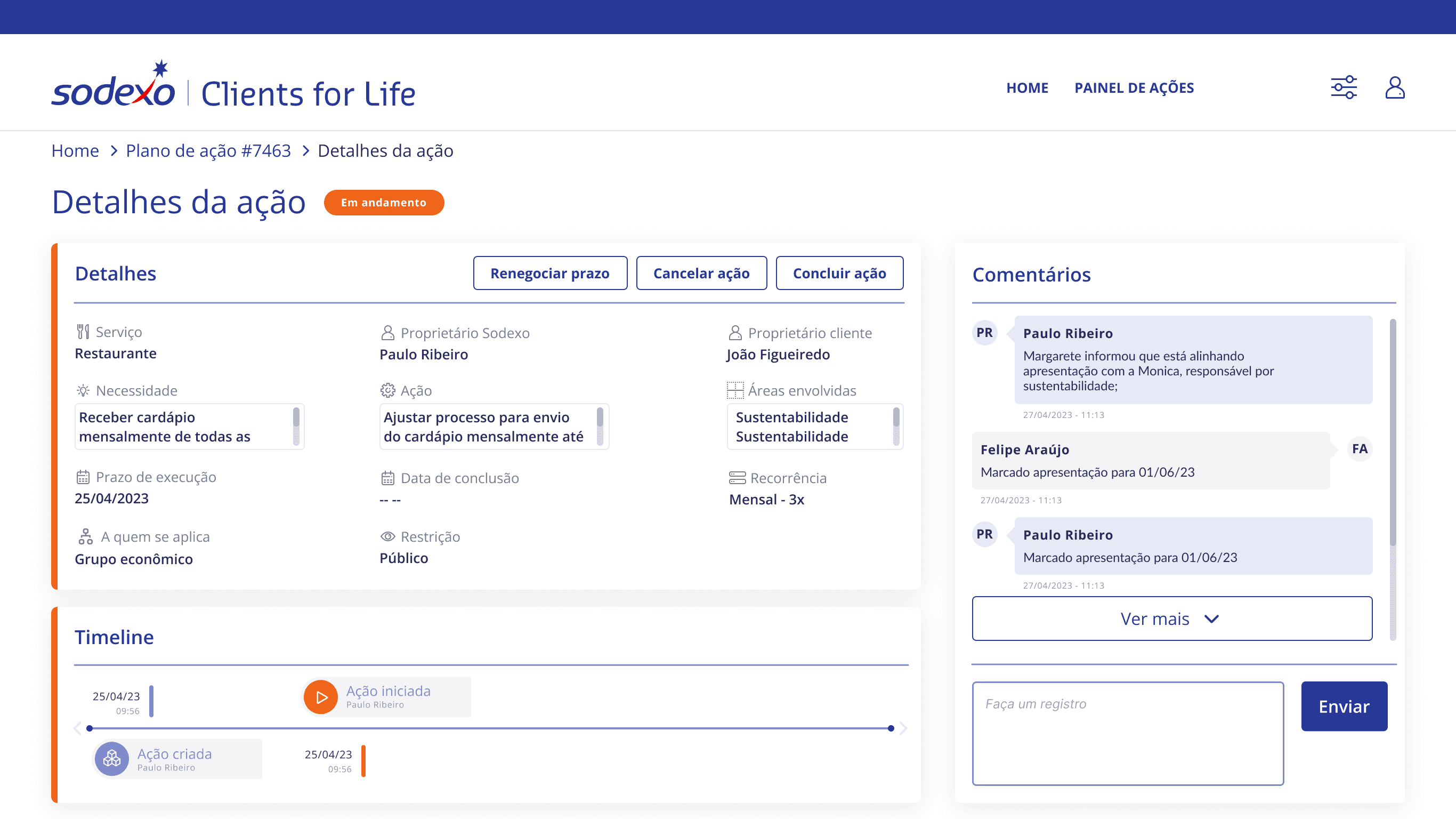
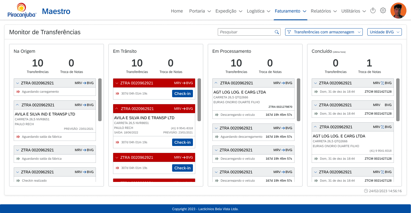
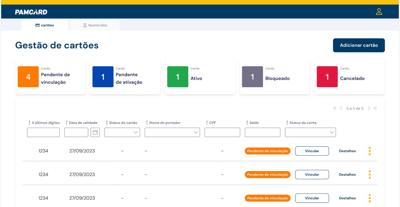
FIG. 1-4
Screens from existing products used during the component mapping phase.
The Solution
What I shipped
Minerva introduced a shared set of foundations, components, and patterns that designers could reuse when building products on the low-code platform.
01
Foundations
The foundations defined the visual rules of Minerva, including colors, typography, spacing, and layout guidelines. They helped designers keep interfaces consistent across products while still adapting the system for different brands.
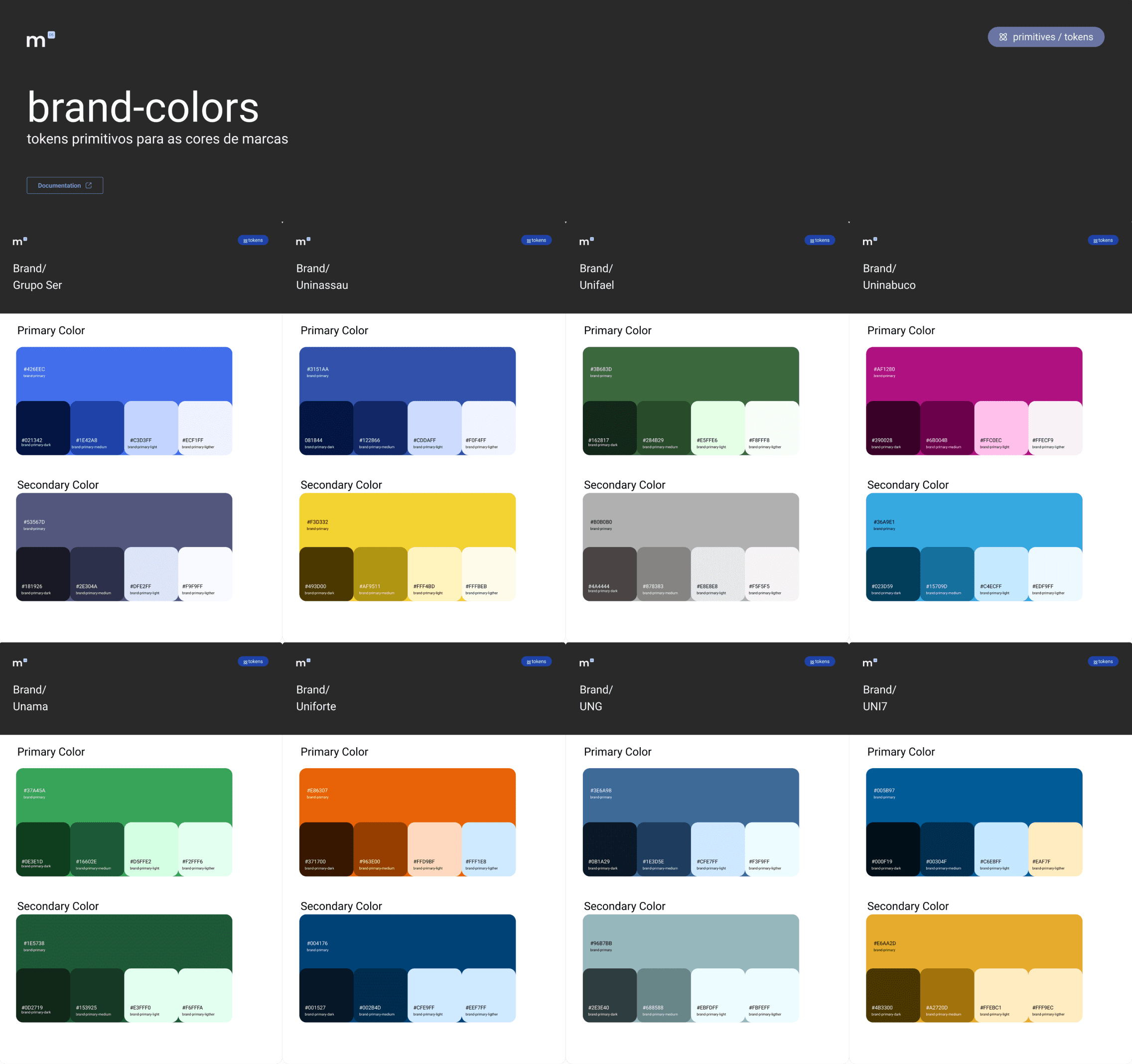
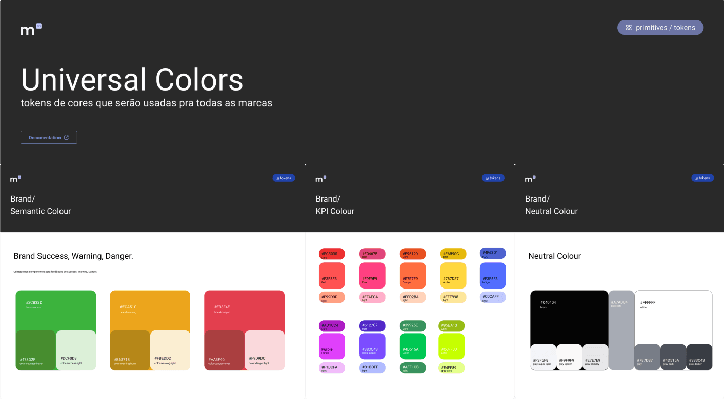
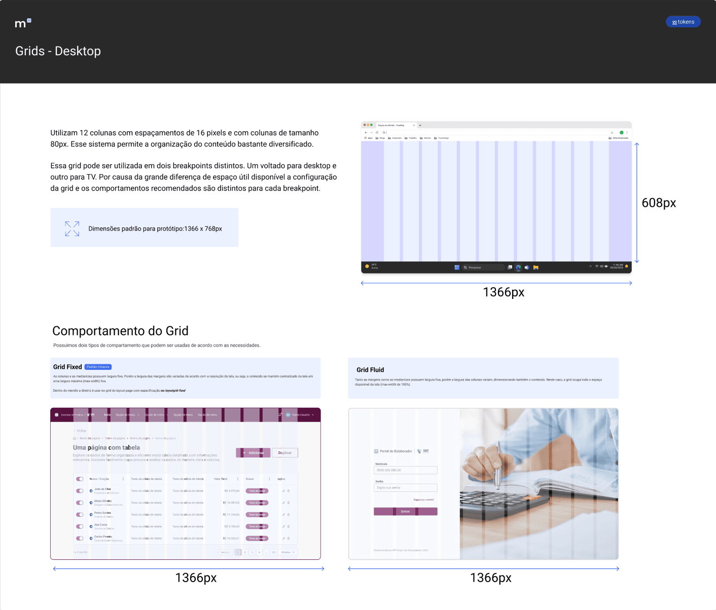
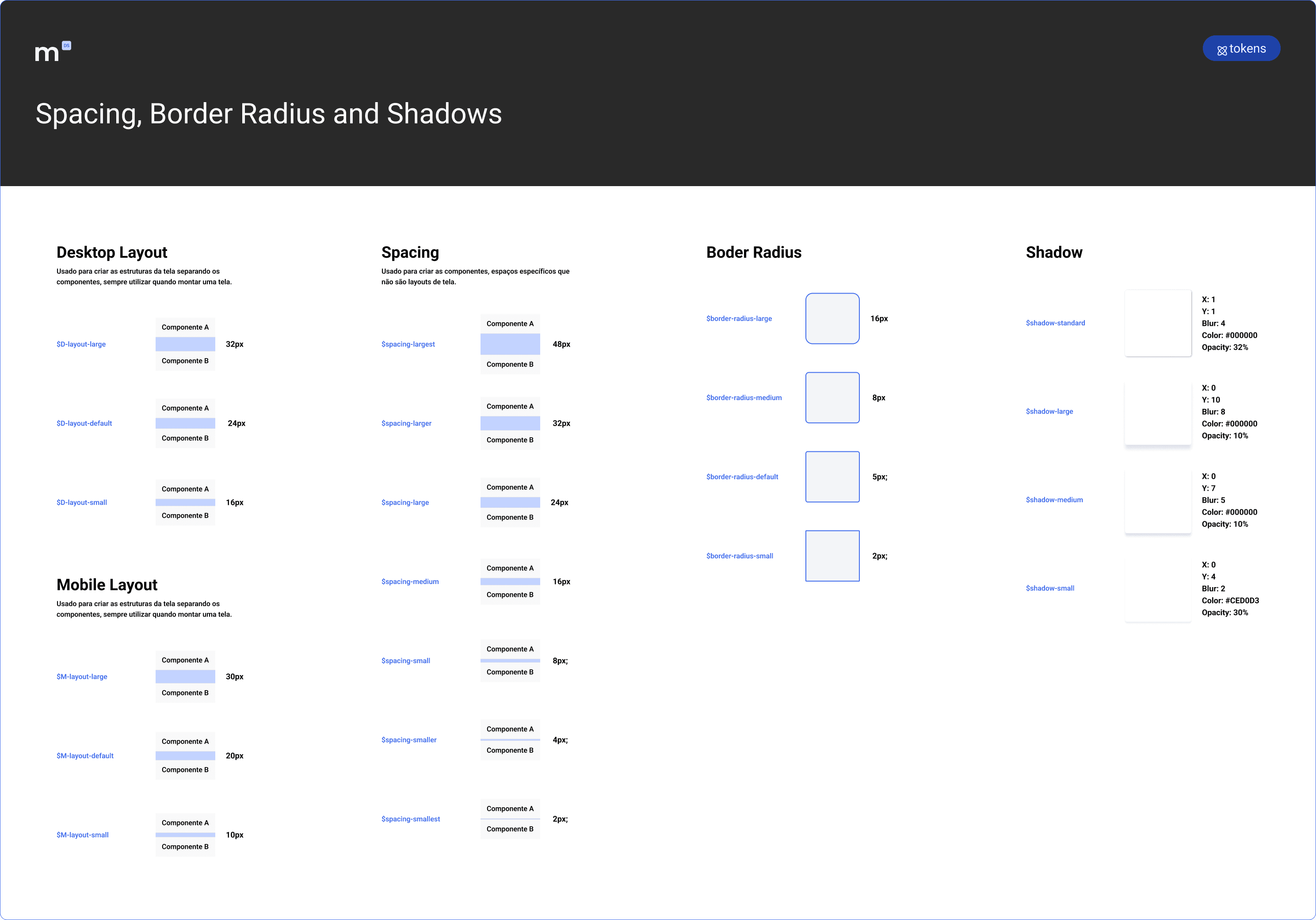
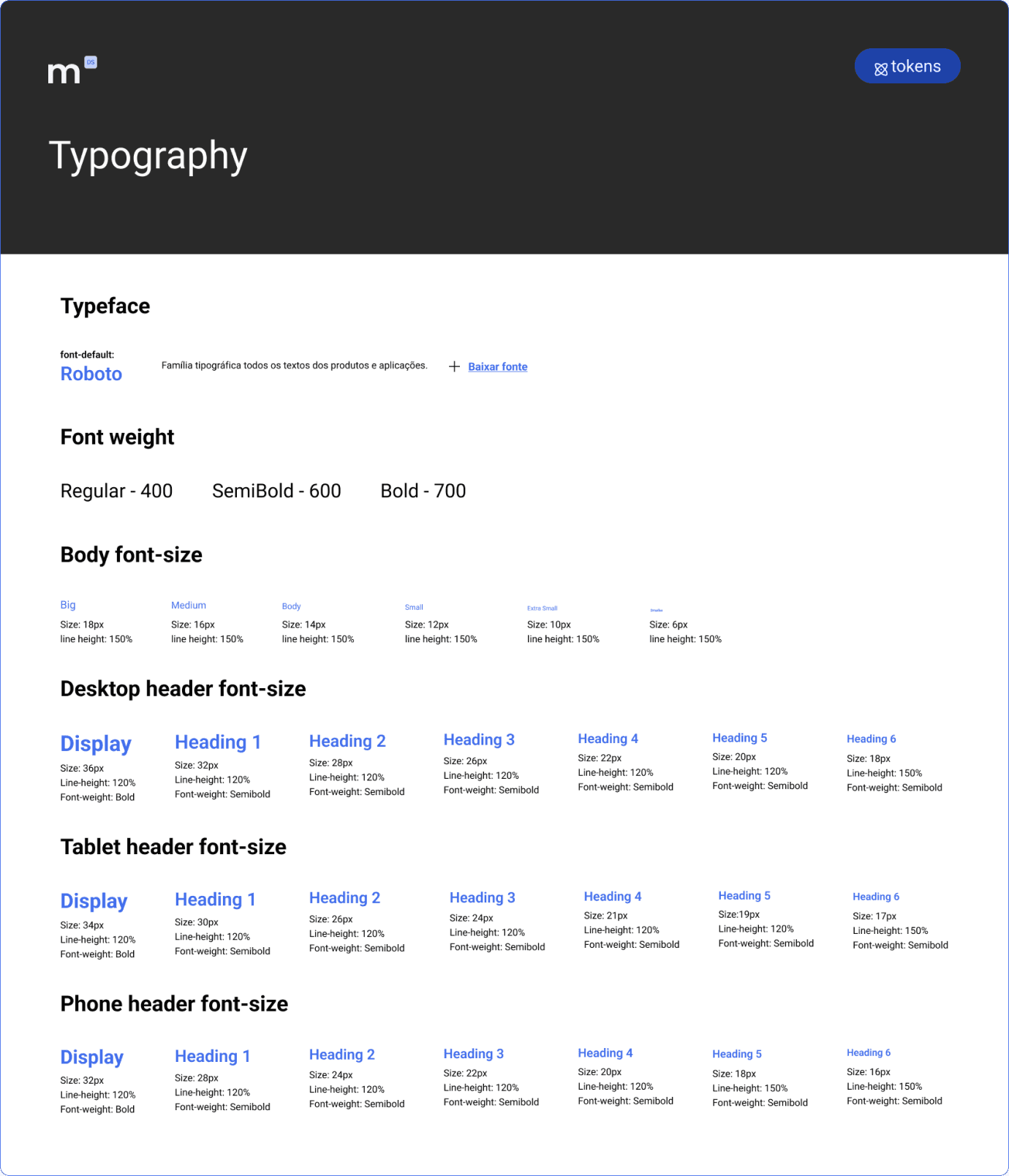
FIG. 5
Brand colors, universal colors, spacing, and typography foundations.
Brand flexibility
Consistent visual rules
Reusable layout standards
02
Core Components
The initial release of Minerva included 42+ mapped components used across products built on the platform. Because the system continued to grow over time, the visuals below highlight only a portion of the component library.
Not every component existed natively in the platform. When one didn't, it went through a defined loop: designed in Figma, attempted by development, technical limits fed back into design, adapted, then absorbed into the system as a standard component. What used to be design-dev friction became a formal process.
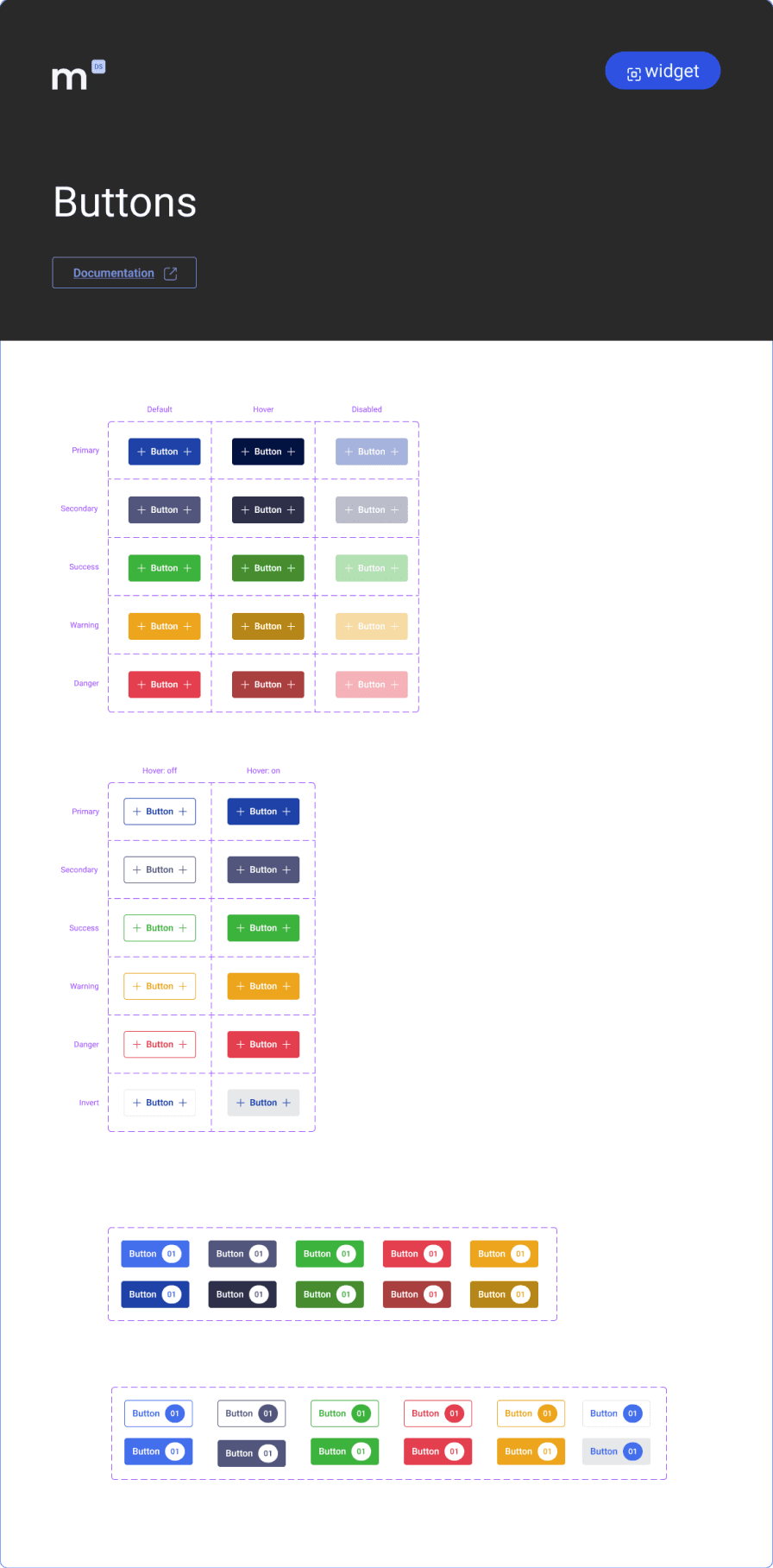
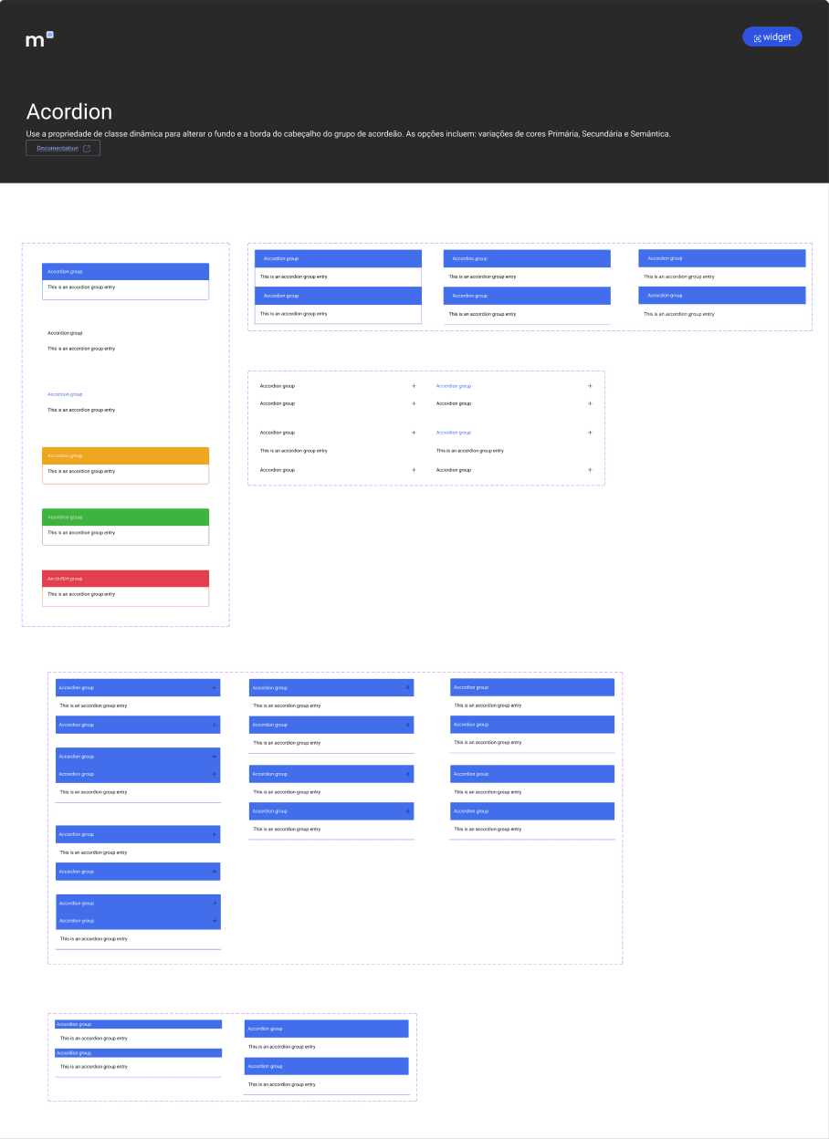
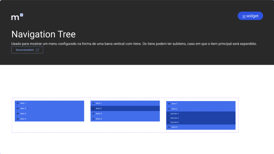
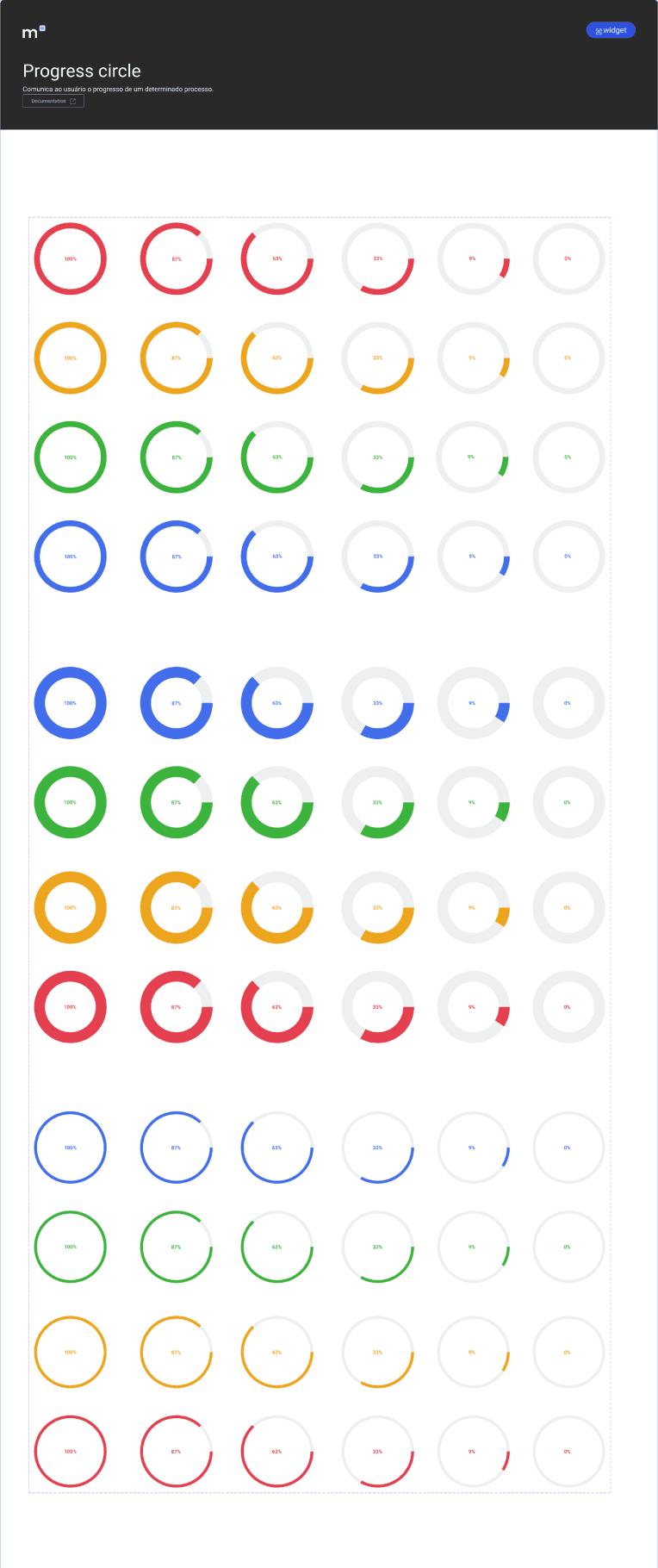
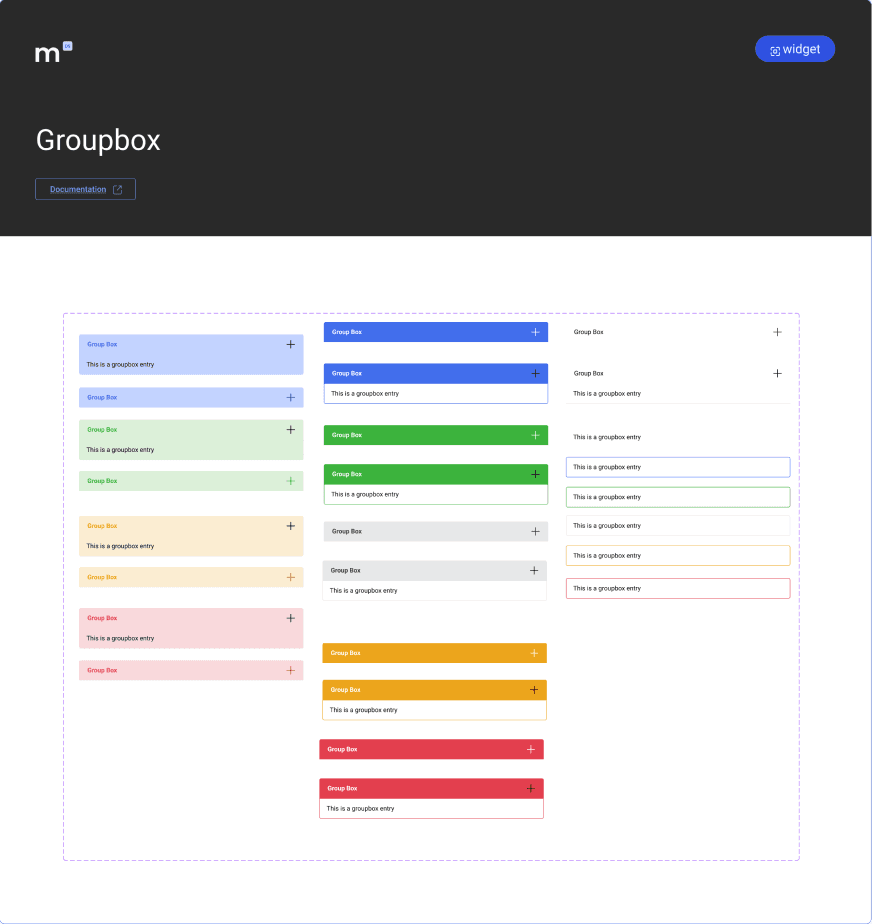
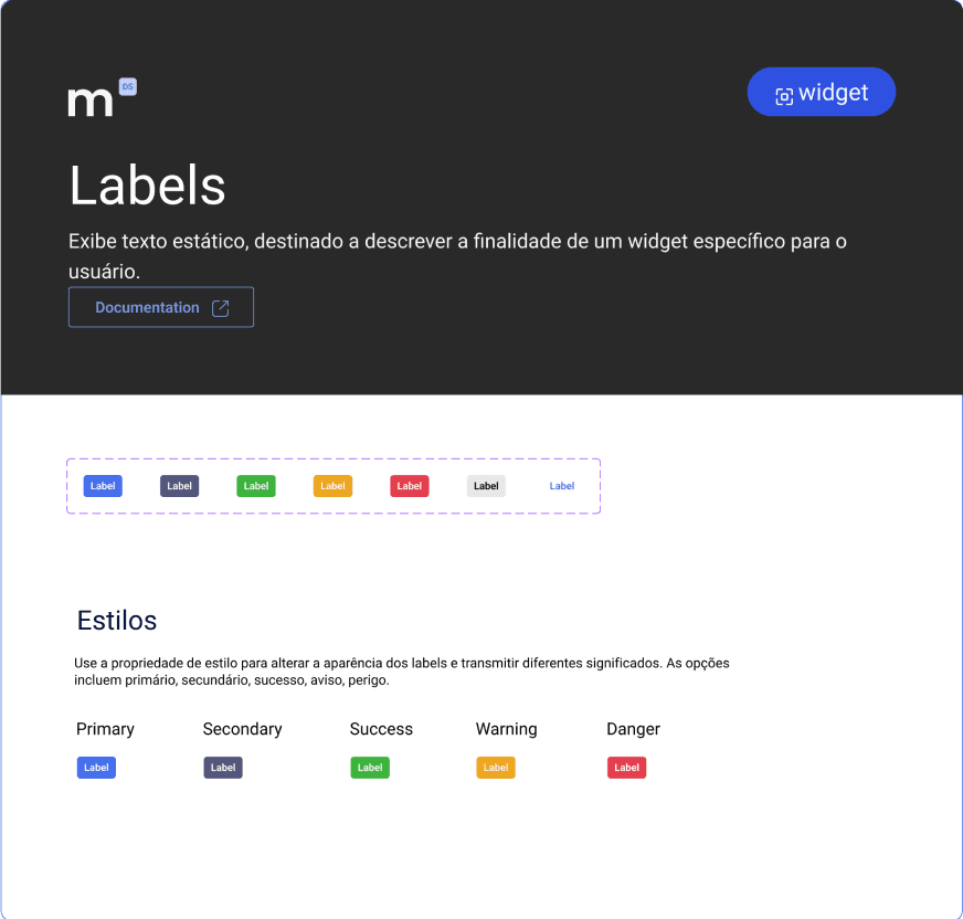
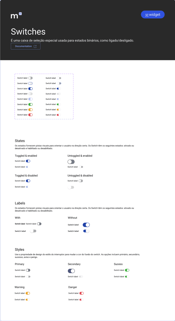
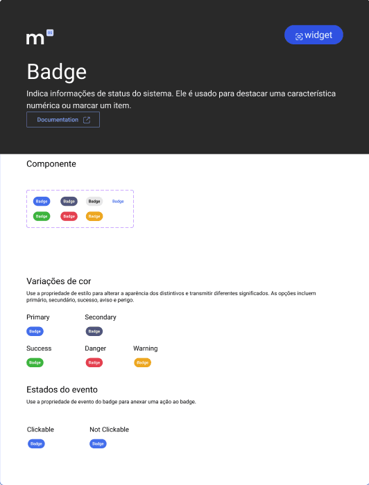
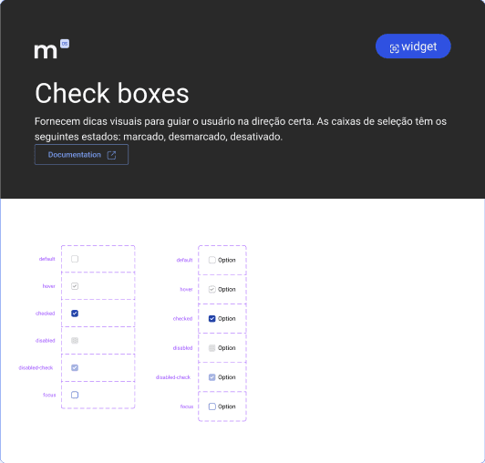
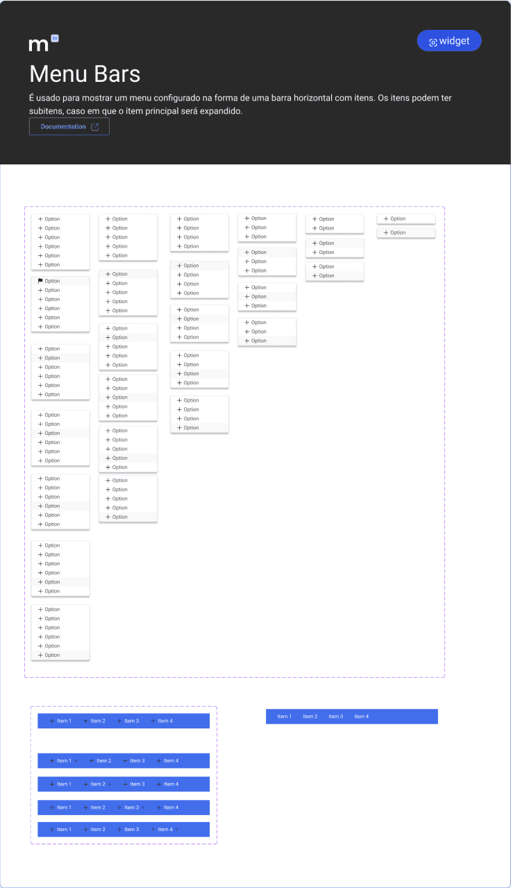
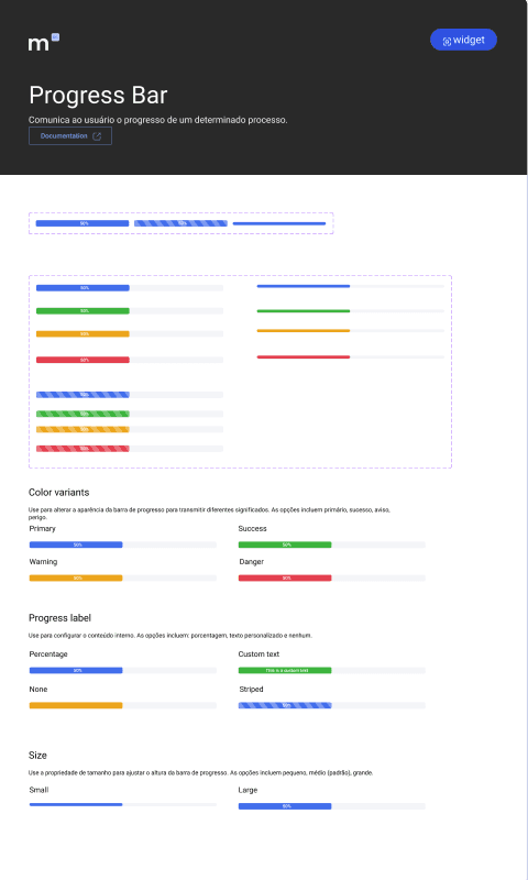
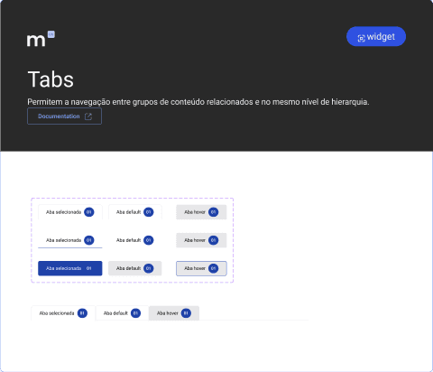
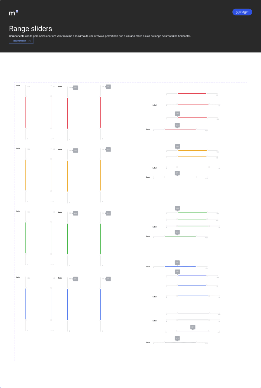
FIG. 6
Component library documentation across categories.
42+ mapped components
Low-code aligned components
Built within platform constraints
Consistent component usage
03
Icon Library
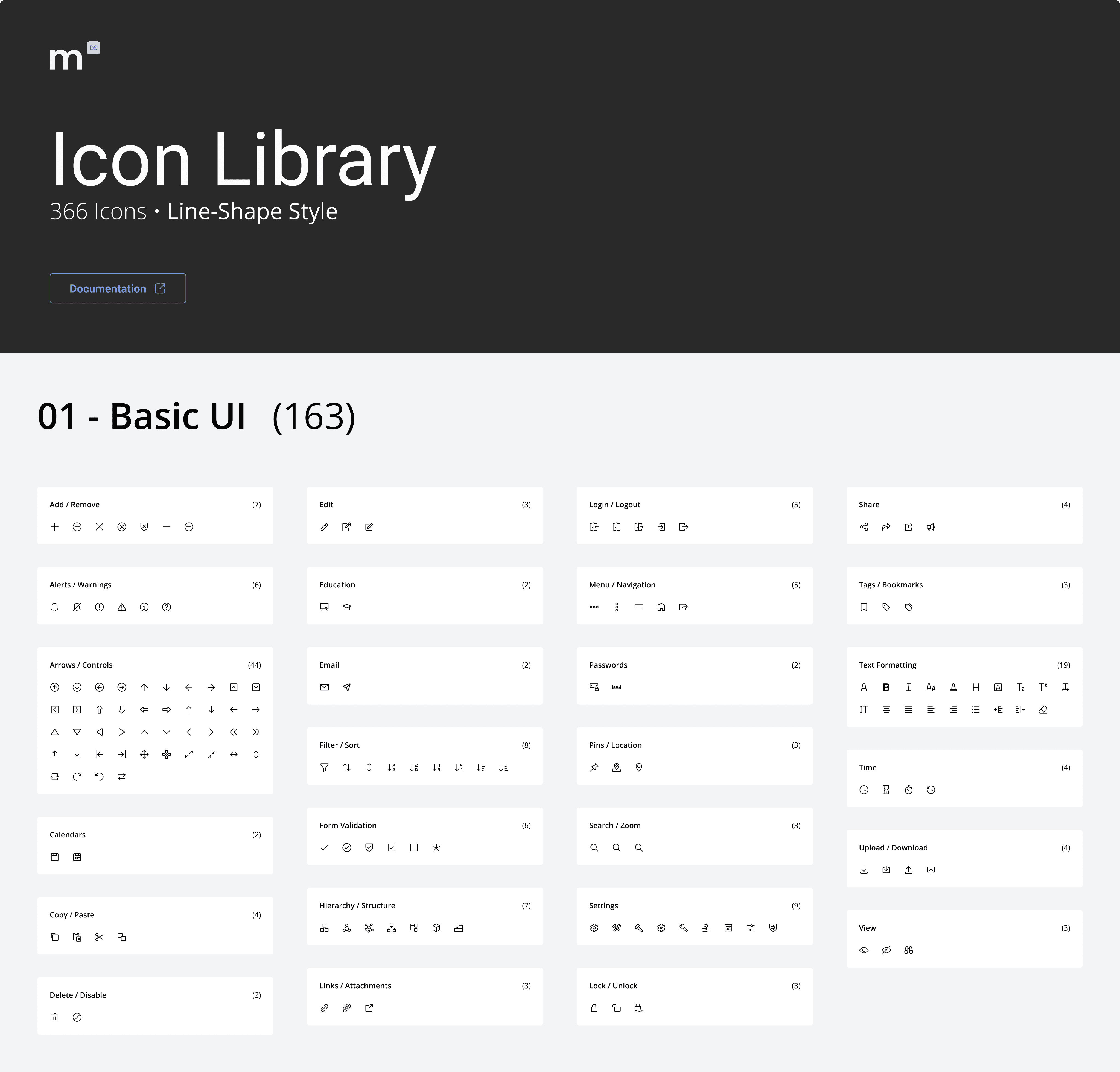
To ensure consistent visual communication across products, I created a shared icon library organized by categories and styles.
The system includes 366 line icons and 366 filled icons, covering common interface needs such as UI actions, business workflows, technology, documents, users, and more. Icons were grouped into categories and organized alphabetically to make them easier for designers to find and reuse.
Text Formatting
(19)
Arrows / Controls
(44)
Documents / Notes
(12)
Media Controls
(15)
Cloud
(15)
Devices
(10)
Disks
(8)
Message Bubbles
(10)
Awards / Rewards
(6)
Nature
(7)
FIG. 7
Icon library organized by category and style.
732 total icons
Line + filled styles
Organized by category
REFLECTION
Lessons from this project
What worked
One of the things that worked best was creating a system flexible enough to support different low-code products without losing consistency. Having reusable components and a structured icon library made the design process much faster over time.
What I'd improve
Looking back, I would involve development and product teams earlier in some decisions. Since the system kept evolving, earlier alignment could have helped us scale documentation and implementation more efficiently.
Key lesson
This project taught me that a design system for low-code is not a visual system. It is a contract with the platform's constraints: every component is a negotiation between what design wants and what the platform can reliably build. Respecting that contract is what made the system fast to adopt instead of fast to abandon.
“What started as an attempt to organize a single product eventually became a scalable foundation used across multiple low-code products and teams.”
next project
PIRACANJUBA
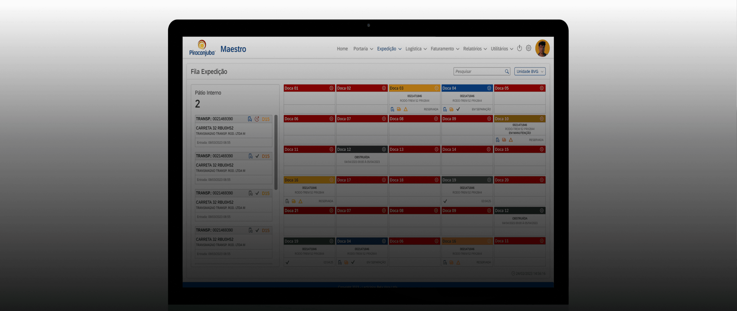
Improving Enterprise Workflows Through Internal Tools
Impact
What changed
42+ reusable components
Documented and standardized core UI components.
Faster UI creation
Reduced repetitive design work across low-code products.
Better design-dev consistency
Aligned interface patterns with low-code constraints.
Scalable product foundation
Created a system that could evolve with teams.
role
Lead Product Designer
timeline
~3 months
team
2 Product Designers
tools
Figma, FigJam
platform
Internal Low-Code Platform
CASE STUDY 03
Scaling Product Design in a Low-Code Environment
TrueChange builds digital products for different companies on a shared low-code platform. I led the creation of the Minerva Design System: reusable components and foundations aligned with the platform's constraints, now supporting 80+ products and the developers and designers who build them.
Problem
TrueChange builds digital products for different companies using a shared low-code platform. Although many of the same interface components were reused across projects, there was no design system to support designers. This meant components were often recreated from scratch, prototypes sometimes included elements that were difficult to implement quickly in low-code, and valuable time was lost during the design process.
My Role
As Product Designer, I initiated and led the creation of the Minerva Design System. I conducted a UI audit across existing products, mapped component needs collaboratively with the design team, defined the foundations, and built the component library aligned with the low-code platform's capabilities. A second designer partnered on documentation, variations, and consistency validation.
Outcome
The project resulted in a documented design system aligned with the low-code platform, adopted across 80+ products built by around 120 developers. As adoption grew, developers had fewer questions about component behavior and fewer implementation bugs. The system is now on v2.0, evolving collaboratively beyond its original scope.
The PROBLEM
Understanding the challenge
TrueChange develops products for different companies using the same low-code platform. While many interface patterns and components were repeatedly used across projects, there was no shared system to guide designers. As a result, components were often recreated from scratch, and prototypes sometimes included elements that were difficult to implement within the platform and prototypes sometimes included elements that were difficult to implement within the platform. In low-code, that gap is expensive: what the design proposes and what the platform can build are not the same thing by default.
This created unnecessary friction in the design process and made it harder to maintain consistency across products.
Product A
Product B
Product C
Shared Low-Code Platform
No Design System
Repeated Components
Inconsistent Interfaces
Slower Design Process
PROCESS
How we got there
Before defining the system itself, I reviewed 23+ products built on the platform to understand how interfaces were being designed in practice. Analyzing screens and flows across projects revealed the UI patterns designers were repeatedly recreating, and those patterns became the foundation of the Minerva design system.
Before designing components, I also studied the platform's native component library to understand what it offered and where its limits were. The direction was clear: prioritize native components, extend only where the platform genuinely fell short. Designing against the platform's real capabilities from the start eliminated rework later.
FIG. 1-4
Screens from existing products used during the component mapping phase.
The Solution
What I shipped
Minerva introduced a shared set of foundations, components, and patterns that designers could reuse when building products on the low-code platform.
01
Foundations
The foundations defined the visual rules of Minerva, including colors, typography, spacing, and layout guidelines. They helped designers keep interfaces consistent across products while still adapting the system for different brands.
Brand flexibility
Consistent visual rules
Reusable layout standards
02
Core Components
The initial release of Minerva included 42+ mapped components used across products built on the platform. Because the system continued to grow over time, the visuals below highlight only a portion of the component library.
Not every component existed natively in the platform. When one didn't, it went through a defined loop: designed in Figma, attempted by development, technical limits fed back into design, adapted, then absorbed into the system as a standard component. What used to be design-dev friction became a formal process.
42+ mapped components
Low-code aligned components
Faster interface creation
Consistent component usage
03
Icon Library
To ensure consistent visual communication across products, I created a shared icon library organized by categories and styles.
The system includes 366 line icons and 366 filled icons, covering common interface needs such as UI actions, business workflows, technology, documents, users, and more. Icons were grouped into categories and organized alphabetically to make them easier for designers to find and reuse.
Text Formatting
(19)
Arrows / Controls
(44)
Documents / Notes
(12)
Media Controls
(15)
Cloud
(15)
Devices
(10)
Disks
(8)
Message Bubbles
(10)
Awards / Rewards
(6)
Nature
(7)
732 total icons
Line + filled styles
Organized by category
REFLECTION
Lessons from this project
What worked
One of the things that worked best was creating a system flexible enough to support different low-code products without losing consistency. Having reusable components and a structured icon library made the design process much faster over time.
What I'd improve
Looking back, I would involve development and product teams earlier in some decisions. Since the system kept evolving, earlier alignment could have helped us scale documentation and implementation more efficiently.
Key lesson
This project taught me that a design system for low-code is not a visual system. It is a contract with the platform's constraints: every component is a negotiation between what design wants and what the platform can reliably build. Respecting that contract is what made the system fast to adopt instead of fast to abandon.
“What started as an attempt to organize a single product eventually became a scalable foundation used across multiple low-code products and teams.”
Impact
What changed
42+ reusable components
Documented and standardized core UI components.
Faster UI creation
Reduced repetitive design work across low-code products.
Better design-dev consistency
Aligned interface patterns with low-code constraints.
Scalable product foundation
Created a system that could evolve with teams.
role
Lead Product Designer
timeline
~3 months
team
2 product
designers
tools
Figma, FigJam,
platform
Internal Low-Code Platform
next project
PIRACANJUBA
Improving Enterprise Workflows Through Internal Tools
PIRACANJUBA
Improving Enterprise Workflows Through Internal Tools
© 2026 Albertine Felipe
CASE STUDY 03
Scaling Product Design in a Low-Code Environment
TrueChange builds digital products for different companies on a shared low-code platform. I led the creation of the Minerva Design System: reusable components and foundations aligned with the platform's constraints, now supporting 80+ products and the developers and designers who build them.
Problem
TrueChange builds digital products for different companies using a shared low-code platform. Although many of the same interface components were reused across projects, there was no design system to support designers. This meant components were often recreated from scratch, prototypes sometimes included elements that were difficult to implement quickly in low-code, and valuable time was lost during the design process.
My Role
As Product Designer, I initiated and led the creation of the Minerva Design System. I conducted a UI audit across existing products, mapped component needs collaboratively with the design team, defined the foundations, and built the component library aligned with the low-code platform's capabilities. A second designer partnered on documentation, variations, and consistency validation.
Outcome
The project resulted in a documented design system aligned with the low-code platform, adopted across 80+ products built by around 120 developers. As adoption grew, developers had fewer questions about component behavior and fewer implementation bugs. The system is now on v2.0, evolving collaboratively beyond its original scope.
The PROBLEM
Understanding the challenge
TrueChange develops products for different companies using the same low-code platform. While many interface patterns and components were repeatedly used across projects, there was no shared system to guide designers. As a result, components were often recreated from scratch, and prototypes sometimes included elements that were difficult to implement within the platform and prototypes sometimes included elements that were difficult to implement within the platform. In low-code, that gap is expensive: what the design proposes and what the platform can build are not the same thing by default.
This created unnecessary friction in the design process and made it harder to maintain consistency across products.
Product A
Product B
Product C
Shared Low-Code Platform
No Design System
Repeated Components
Inconsistent Interfaces
Slower Design Process
PROCESS
How we got there
Before defining the system itself, I reviewed 23+ products built on the platform to understand how interfaces were being designed in practice. Analyzing screens and flows across projects revealed the UI patterns designers were repeatedly recreating, and those patterns became the foundation of the Minerva design system.
Before designing components, I also studied the platform's native component library to understand what it offered and where its limits were. The direction was clear: prioritize native components, extend only where the platform genuinely fell short. Designing against the platform's real capabilities from the start eliminated rework later.
FIG. 1-4
Screens from existing products used during the component mapping phase.
role
Lead Product Designer
timeline
~3 months
team
2 product designers
tools
Figma, FigJam,
platform
Internal Low-Code Platform
The Solution
What I shipped
Minerva introduced a shared set of foundations, components, and patterns that designers could reuse when building products on the low-code platform.
01
Foundations
The foundations defined the visual rules of Minerva, including colors, typography, spacing, and layout guidelines. They helped designers keep interfaces consistent across products while still adapting the system for different brands.
Brand flexibility
Consistent visual rules
Reusable layout standards
02
Core Components
The initial release of Minerva included 42+ mapped components used across products built on the platform. Because the system continued to grow over time, the visuals below highlight only a portion of the component library.
Not every component existed natively in the platform. When one didn't, it went through a defined loop: designed in Figma, attempted by development, technical limits fed back into design, adapted, then absorbed into the system as a standard component. What used to be design-dev friction became a formal process.
42+ mapped components
Low-code aligned components
Faster interface creation
Consistent component usage
03
Icon Library
To ensure consistent visual communication across products, I created a shared icon library organized by categories and styles.
The system includes 366 line icons and 366 filled icons, covering common interface needs such as UI actions, business workflows, technology, documents, users, and more. Icons were grouped into categories and organized alphabetically to make them easier for designers to find and reuse.
Text Formatting
(19)
Arrows / Controls
(44)
Documents / Notes
(12)
Media Controls
(15)
Cloud
(15)
Devices
(10)
Disks
(8)
Message Bubbles
(10)
Awards / Rewards
(6)
Nature
(7)
732 total icons
Line + filled styles
Organized by category
Impact
Measurable results
42+ reusable components
Documented and standardized core UI components.
Faster UI creation
Reduced repetitive design work across low-code products.
Better design-dev consistency
Aligned interface patterns with low-code constraints.
Scalable product foundation
Created a system that could evolve with teams.
REFLECTION
Lessons from this project
What worked
One of the things that worked best was creating a system flexible enough to support different low-code products without losing consistency. Having reusable components and a structured icon library made the design process much faster over time.
What I'd improve
Looking back, I would involve development and product teams earlier in some decisions. Since the system kept evolving, earlier alignment could have helped us scale documentation and implementation more efficiently.
Key lesson
This project taught me that a design system for low-code is not a visual system. It is a contract with the platform's constraints: every component is a negotiation between what design wants and what the platform can reliably build. Respecting that contract is what made the system fast to adopt instead of fast to abandon.
“What started as an attempt to organize a single product eventually became a scalable foundation used across multiple low-code products and teams.”
next project
© 2026 Albertine Felipe