CASE STUDY 04
Improving Enterprise Workflows Through Internal Tools
Designing dashboards, forms, and internal portals to support operational workflows for one of Brazil’s largest dairy companies.
© 2026 Albertine Felipe
Problem
Piracanjuba had several internal workflows spread across different operational needs, including customer, supplier, employee, logistics, transportation, and invoice-related processes. Interfaces were dated, some functions were broken, and extracting information quickly was hard for the roughly 300 employees who used these tools every day. The company needed clearer interfaces that followed enterprise standards.
My Role
As the only designer, I led the product front initially and later shared it with a P.O., working directly with stakeholders to redesign forms, portals, and dashboards on SAP Fiori principles. Before designing, I audited every legacy tool first-hand to guarantee functional parity and identify improvements.
Outcome
After launch, support tickets about these tools nearly disappeared; the ones that remained were technical issues, not usage questions. Client satisfaction with the first contract led to an expanded scope, including new tools built from scratch.
The PROBLEM
Understanding the challenge
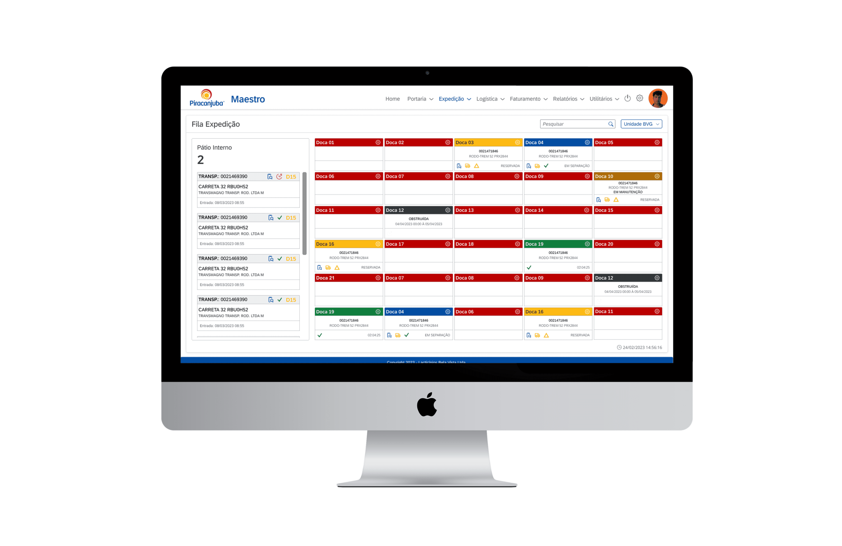
Piracanjuba already had several internal tools supporting important operational workflows, but many were built on older systems that no longer reflected the clarity and usability teams needed in their daily work. The interfaces felt dated, visually dense, and often lacked clear hierarchy, making information harder to scan and tasks less intuitive to complete.
Because these tools were tied to established business processes, the challenge was not to reinvent the workflows, but to improve how they were presented and used. The redesign also needed to align with SAP Fiori principles, bringing more consistency, structure, and enterprise usability to the experience.
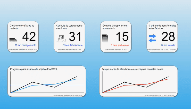
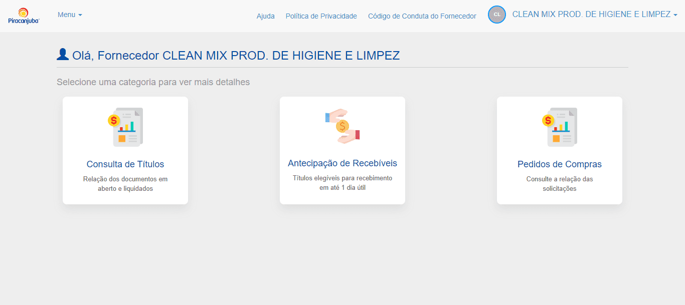
FIG. 1
Legacy tools with dense layouts and limited hierarchy.
The PROCESS
How I got there
Since the workflows were already defined by Piracanjuba's internal business rules, my process focused on understanding the requirements directly with stakeholders and translating them into clearer enterprise interfaces. Research ran through key users, the leaders and managers of each area, who centralized the needs and feedback of their teams.
I used SAP Fiori principles as a reference to redesign forms, dashboards, and portals with more structure, consistency, and usability. The goal was to keep the tools aligned with enterprise standards while making daily operational tasks easier to complete and information easier to scan.
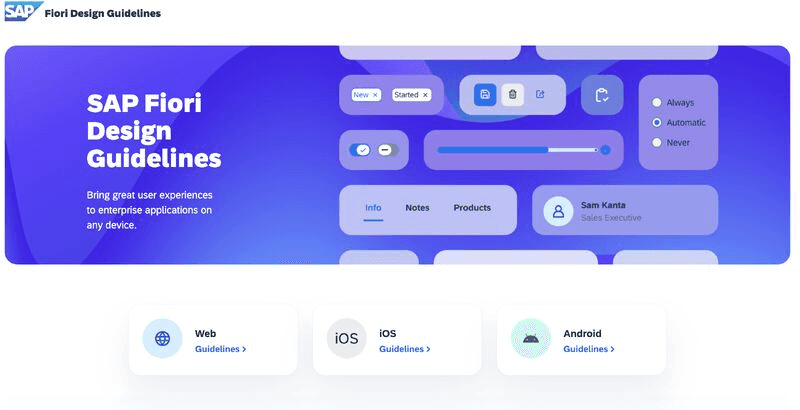
FIG. 2
SAP Fiori guidelines as the design reference.
The Solution
What we shipped
I worked across different internal tools used by Piracanjuba's teams and partners: 32+ corporate management forms, five monitoring tools, and operational dashboards built from scratch, used daily by around 300 employees.
01
Maestro Operational Dashboard
Maestro was the most important internal tool in this project. I designed dashboard views to help teams monitor invoice issuing, monthly goals, order volume by branch, and operational status in a more visual and organized way. Where a chart type hit a technical limitation, I adapted the visualization with the developers rather than forcing the original choice, keeping the information intact.
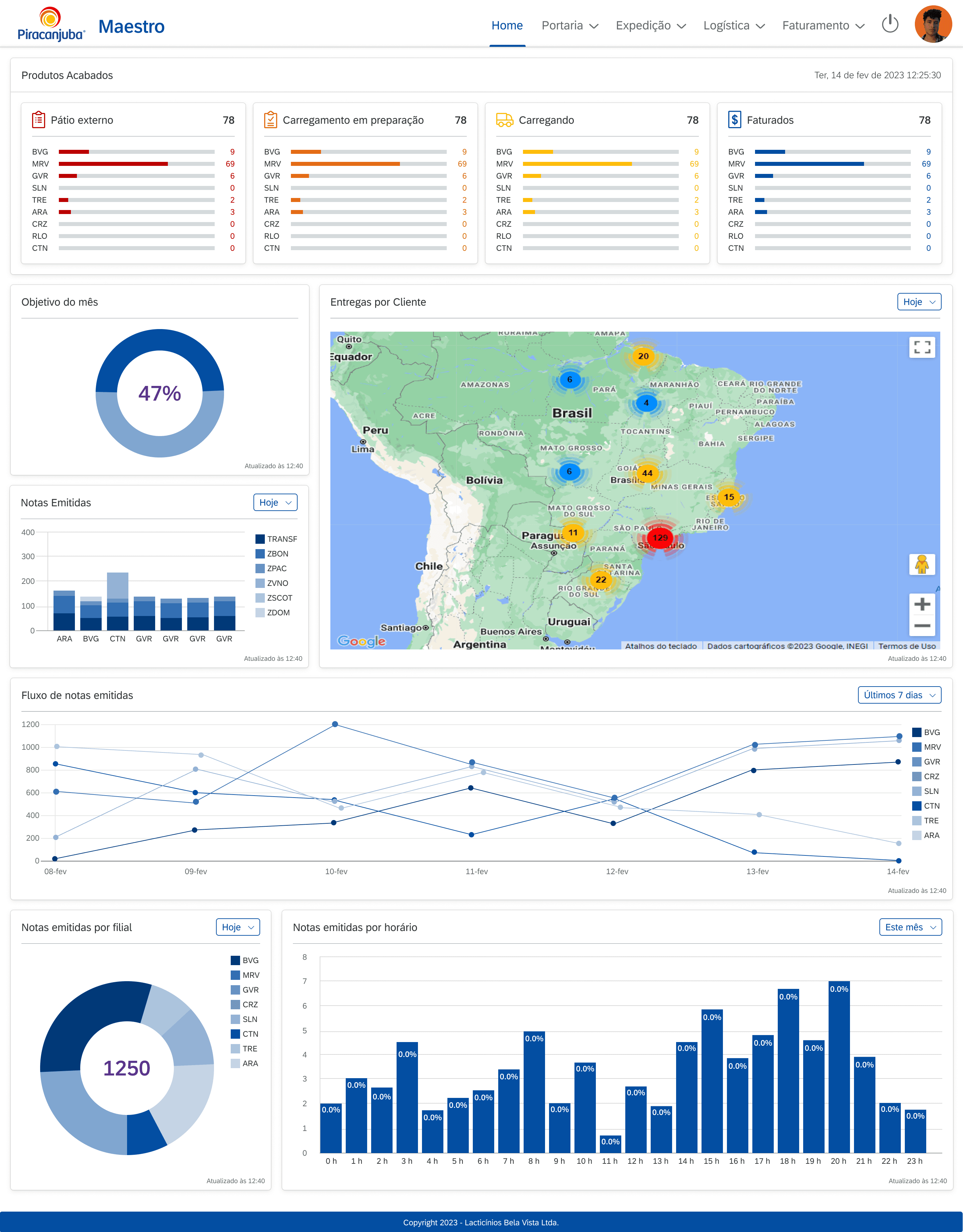
FIG. 3
New Dashboard overview
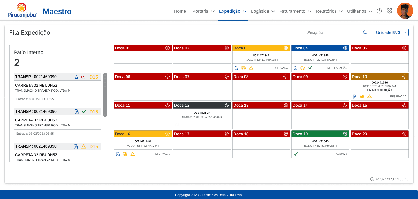
FIG. 4
Expedition schedule
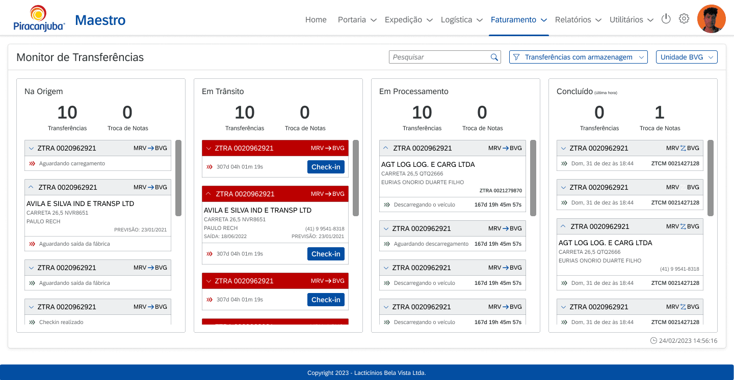
FIG. 5
Transfer monitoring
Faster insight scanning
Clear dashboard hierarchy
Operational visibility
02
Request Portal Forms
The request portal supported different internal demands involving customers, suppliers, employees, and logistics. Many employees filled the same forms dozens of times a day, so I grouped correlated information to reduce the cognitive load of repetition: for someone on their thirtieth submission, structure is not refinement, it is the product.
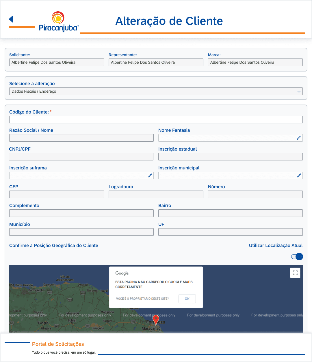
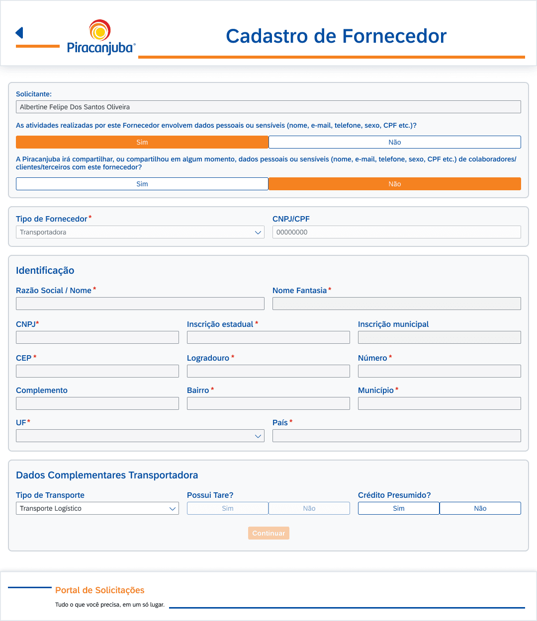
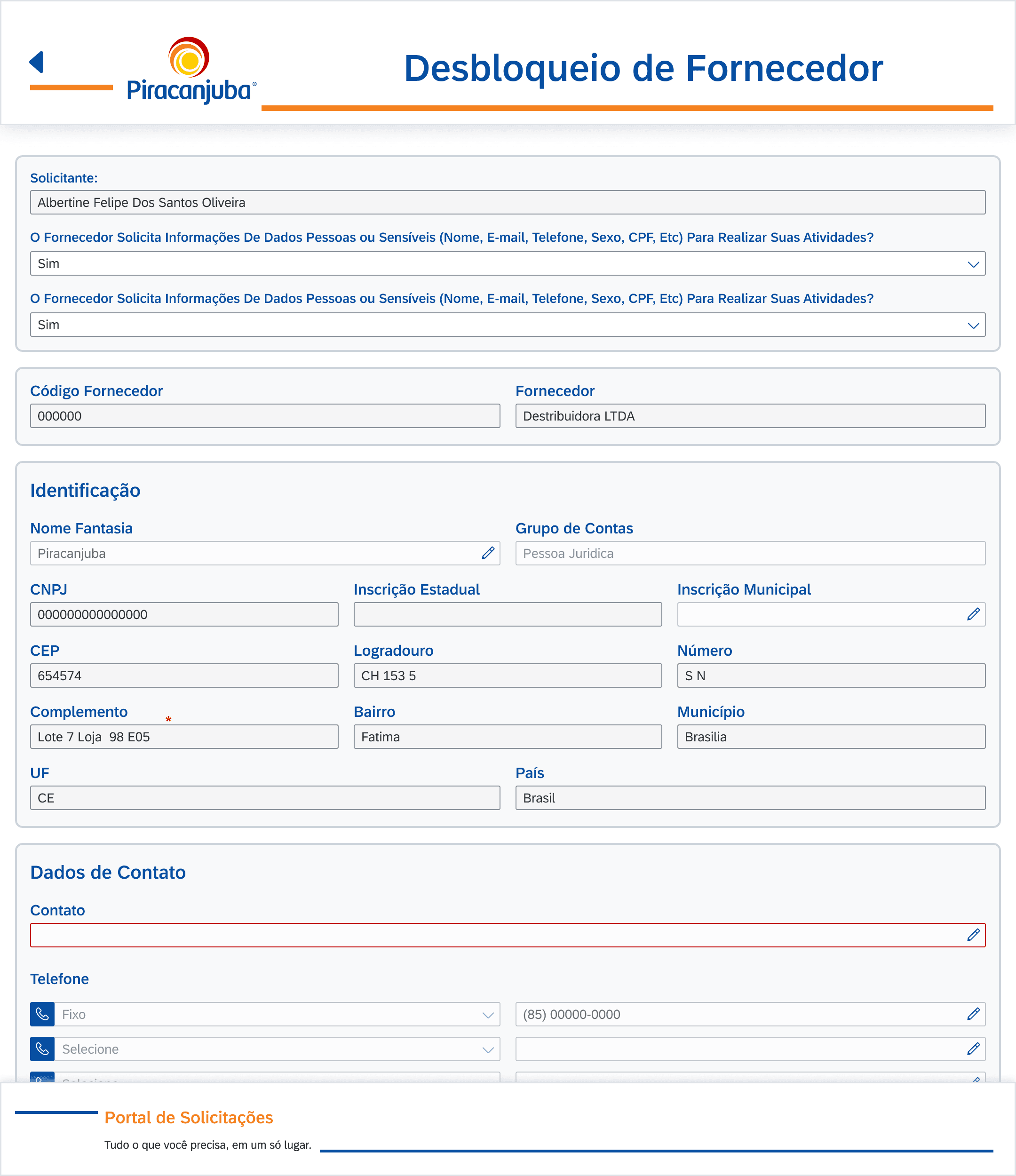
FIG. 6
New Request Form Examples
Clearer form structure
More organized fields
Easier request creation
03
Transporter Portal Experience
The transporter portal supported logistics teams and partners in managing transportation-related demands. I focused on making operational status, task context, and next actions easier to understand, so users could follow each occurrence and act with more clarity inside the workflow.
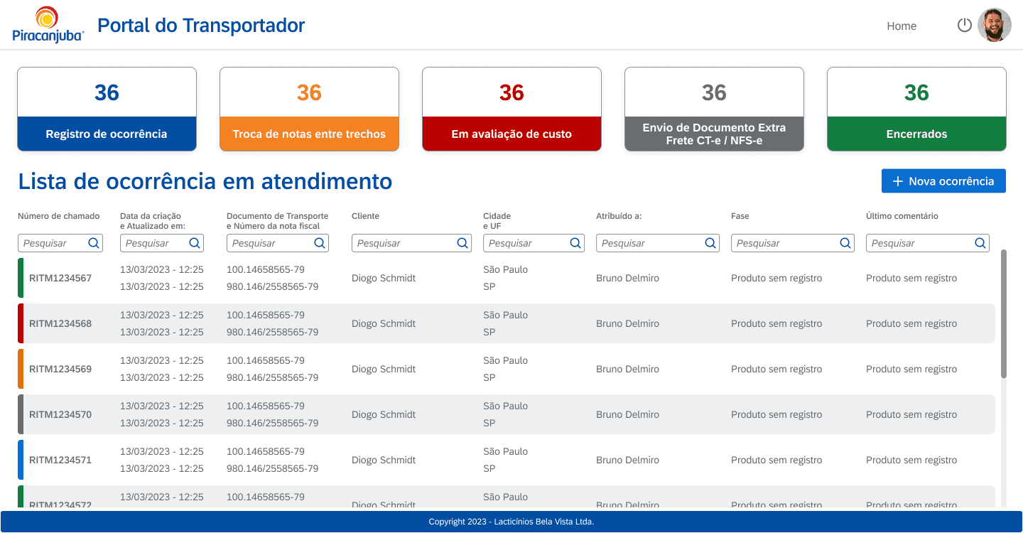
FIG. 7
New Transport Requests Overview
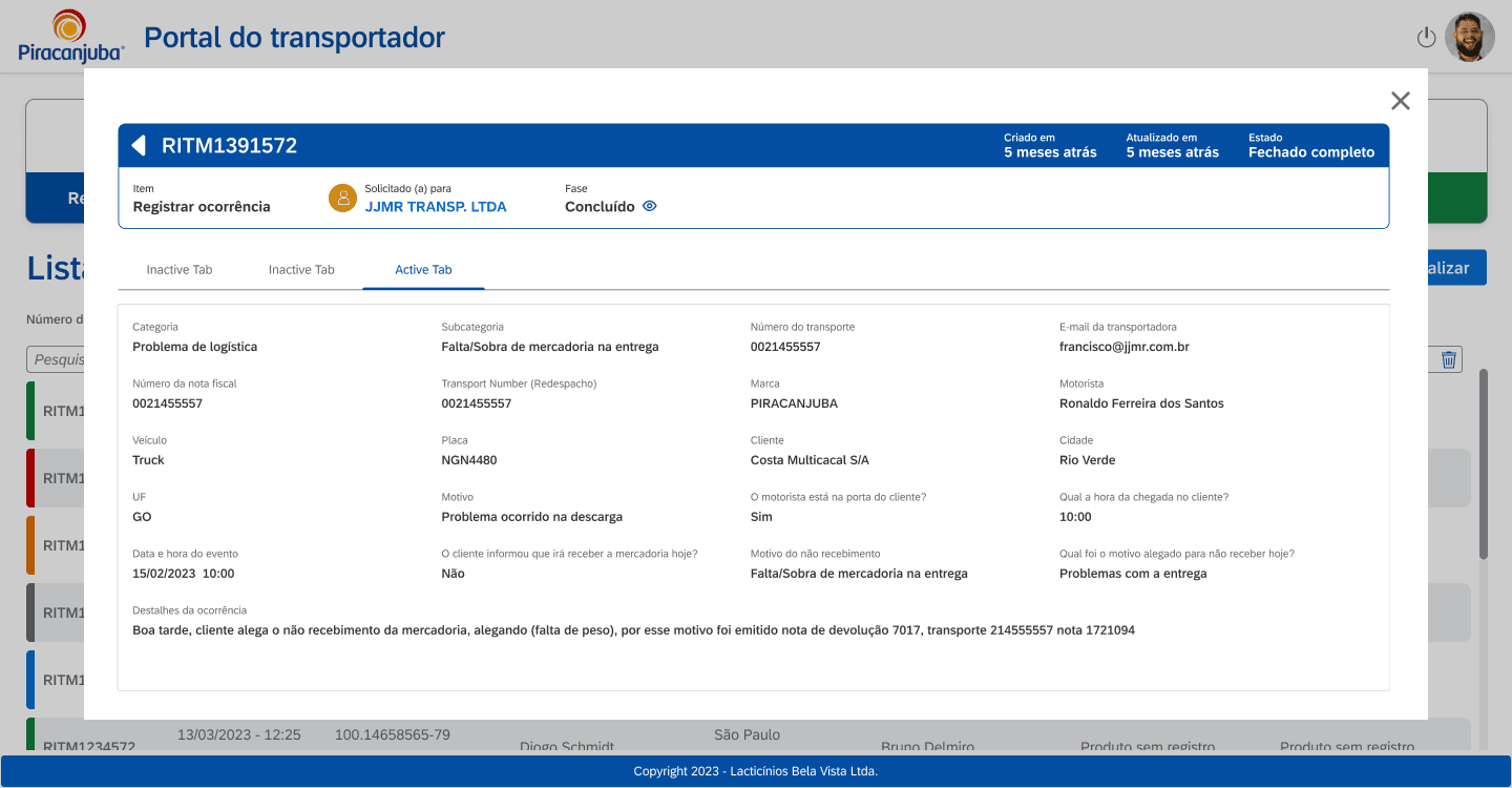
FIG. 8
Occurrence details
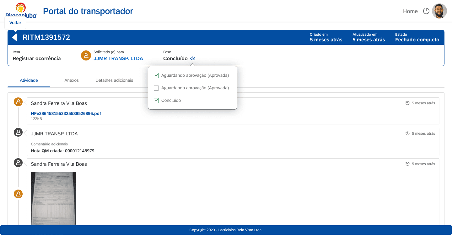
FIG. 9
Activity and status history
More structured logistics workflows
Clearer transport status visibility
Easier access to operational actions
REFLECTION
Lessons from this project
What worked
Working directly with stakeholders helped me understand the business rules behind each internal workflow and translate them into clearer enterprise interfaces. Even without a long discovery phase, this close collaboration made the redesign more aligned with the company’s real operational needs.
What I'd improve
Looking back, I would document more of the process and keep stronger before/after evidence. A lot of the project’s value came from improving internal workflows, and having more artifacts would make that impact easier to communicate later.
Key lesson
This project taught me that enterprise design is about clarity and structure. When someone fills the same form dozens of times a day, reducing cognitive load is not refinement: it is the product itself.
“What started as a set of interface improvements became an opportunity to make complex internal workflows clearer, more structured, and easier for teams to use every day.”
next project
GOEXPLOSION
Event Creation Platform for Creators
Impact
What changed
Support tickets nearly disappeared
Remaining tickets were technical, not usage questions.
Information became faster to find
Operators stopped digging through dense legacy screens.
Repetitive form work got lighter
Restructured forms eased filling them dozens of times a day.
Users started being heard
A new in-product feedback channel, absent in legacy tools.
role
Lead Product Designer
timeline
~14 months
team
1 Product owner, 6 Developers, Q.A.
tools
Figma, FigJam
platform
B2B2C Web Platform
CASE STUDY 04
Improving Enterprise Workflows Through Internal Tools
Designing dashboards, forms, and internal portals to support operational workflows for one of Brazil’s largest dairy companies.
role
Lead Product Designer
timeline
~14 months
team
1 Product owner, 6 Developers, Q.A.
tools
Figma, FigJam
platform
B2B2C Web Platform
Problem
Piracanjuba had several internal workflows spread across different operational needs, including customer, supplier, employee, logistics, transportation, and invoice-related processes. Interfaces were dated, some functions were broken, and extracting information quickly was hard for the roughly 300 employees who used these tools every day. The company needed clearer interfaces that followed enterprise standards.
My Role
As the only designer, I led the product front initially and later shared it with a P.O., working directly with stakeholders to redesign forms, portals, and dashboards on SAP Fiori principles. Before designing, I audited every legacy tool first-hand to guarantee functional parity and identify improvements.
Outcome
After launch, support tickets about these tools nearly disappeared; the ones that remained were technical issues, not usage questions. Client satisfaction with the first contract led to an expanded scope, including new tools built from scratch.
The PROBLEM
Understanding the challenge
Piracanjuba already had several internal tools supporting important operational workflows, but many were built on older systems that no longer reflected the clarity and usability teams needed in their daily work. The interfaces felt dated, visually dense, and often lacked clear hierarchy, making information harder to scan and tasks less intuitive to complete.
Because these tools were tied to established business processes, the challenge was not to reinvent the workflows, but to improve how they were presented and used. The redesign also needed to align with SAP Fiori principles, bringing more consistency, structure, and enterprise usability to the experience.
FIG. 1
Legacy tools with dense layouts and limited hierarchy.
The PROBLEM
How I got there
Since the workflows were already defined by Piracanjuba's internal business rules, my process focused on understanding the requirements directly with stakeholders and translating them into clearer enterprise interfaces. Research ran through key users, the leaders and managers of each area, who centralized the needs and feedback of their teams.
I used SAP Fiori principles as a reference to redesign forms, dashboards, and portals with more structure, consistency, and usability. The goal was to keep the tools aligned with enterprise standards while making daily operational tasks easier to complete and information easier to scan.
FIG. 2
SAP Fiori guidelines as the design reference.
The Solution
What we shipped
I worked across different internal tools used by Piracanjuba's teams and partners: 32+ corporate management forms, five monitoring tools, and operational dashboards built from scratch, used daily by around 300 employees.
01
Maestro Operational Dashboard
Maestro was the most important internal tool in this project. I designed dashboard views to help teams monitor invoice issuing, monthly goals, order volume by branch, and operational status in a more visual and organized way. Where a chart type hit a technical limitation, I adapted the visualization with the developers rather than forcing the original choice, keeping the information intact.
FIG. 3
New Dashboard overview
FIG. 4
Expedition schedule
FIG. 5
Transfer monitoring
Faster insight scanning
Clear dashboard hierarchy
Operational visibility
02
Request Portal Forms
The request portal supported different internal demands involving customers, suppliers, employees, and logistics. Many employees filled the same forms dozens of times a day, so I grouped correlated information to reduce the cognitive load of repetition: for someone on their thirtieth submission, structure is not refinement, it is the product.
FIG. 6
New Request Form Examples
Clearer form structure
More organized fields
Easier request creation
03
Transporter Portal Experience
The transporter portal supported logistics teams and partners in managing transportation-related demands. I focused on making operational status, task context, and next actions easier to understand, so users could follow each occurrence and act with more clarity inside the workflow.
FIG. 7
New Transport Requests Overview
FIG. 8
Occurrence details
FIG. 9
Activity and status history
More structured logistics workflows
Clearer transport status visibility
Easier access to operational actions
Impact
What changed
Support tickets nearly disappeared
Remaining tickets were technical, not usage questions.
Information became faster to find
Operators stopped digging through dense legacy screens.
Repetitive form work got lighter
Restructured forms eased filling them dozens of times a day.
Users started being heard
A new in-product feedback channel, absent in legacy tools.
REFLECTION
Lessons from this project
What worked
Working directly with stakeholders helped me understand the business rules behind each internal workflow and translate them into clearer enterprise interfaces. Even without a long discovery phase, this close collaboration made the redesign more aligned with the company’s real operational needs.
What I'd improve
Looking back, I would document more of the process and keep stronger before/after evidence. A lot of the project’s value came from improving internal workflows, and having more artifacts would make that impact easier to communicate later.
Key lesson
This project taught me that enterprise design is about clarity and structure. When someone fills the same form dozens of times a day, reducing cognitive load is not refinement: it is the product itself.
“What started as a set of interface improvements became an opportunity to make complex internal workflows clearer, more structured, and easier for teams to use every day.”
next project
GOEXPLOSION
Event Creation Platform for Creators
© 2026 Albertine Felipe
CASE STUDY 04
Improving Enterprise Workflows Through Internal Tools
Designing dashboards, forms, and internal portals to support operational workflows for one of Brazil’s largest dairy companies.
role
Lead Product Designer
timeline
~14 months
team
1 Product owner, 6 Developers, Q.A.
tools
Figma, FigJam
platform
B2B2C Web Platform
Problem
Piracanjuba had several internal workflows spread across different operational needs, including customer, supplier, employee, logistics, transportation, and invoice-related processes. Interfaces were dated, some functions were broken, and extracting information quickly was hard for the roughly 300 employees who used these tools every day. The company needed clearer interfaces that followed enterprise standards.
My Role
As the only designer, I led the product front initially and later shared it with a P.O., working directly with stakeholders to redesign forms, portals, and dashboards on SAP Fiori principles. Before designing, I audited every legacy tool first-hand to guarantee functional parity and identify improvements.
Outcome
After launch, support tickets about these tools nearly disappeared; the ones that remained were technical issues, not usage questions. Client satisfaction with the first contract led to an expanded scope, including new tools built from scratch.
The PROBLEM
Understanding the challenge
Piracanjuba already had several internal tools supporting important operational workflows, but many were built on older systems that no longer reflected the clarity and usability teams needed in their daily work. The interfaces felt dated, visually dense, and often lacked clear hierarchy, making information harder to scan and tasks less intuitive to complete.
Because these tools were tied to established business processes, the challenge was not to reinvent the workflows, but to improve how they were presented and used. The redesign also needed to align with SAP Fiori principles, bringing more consistency, structure, and enterprise usability to the experience.
FIG. 1
Legacy tools with dense layouts and limited hierarchy.
The PROBLEM
How I got there
Since the workflows were already defined by Piracanjuba's internal business rules, my process focused on understanding the requirements directly with stakeholders and translating them into clearer enterprise interfaces. Research ran through key users, the leaders and managers of each area, who centralized the needs and feedback of their teams.
I used SAP Fiori principles as a reference to redesign forms, dashboards, and portals with more structure, consistency, and usability. The goal was to keep the tools aligned with enterprise standards while making daily operational tasks easier to complete and information easier to scan.
FIG. 2
SAP Fiori guidelines as the design reference.
The Solution
What we shipped
I worked across different internal tools used by Piracanjuba's teams and partners: 32+ corporate management forms, five monitoring tools, and operational dashboards built from scratch, used daily by around 300 employees.
01
Maestro Operational Dashboard
Maestro was the most important internal tool in this project. I designed dashboard views to help teams monitor invoice issuing, monthly goals, order volume by branch, and operational status in a more visual and organized way. Where a chart type hit a technical limitation, I adapted the visualization with the developers rather than forcing the original choice, keeping the information intact.
FIG. 3
New Dashboard overview
FIG. 4
Expedition schedule
FIG. 5
Transfer monitoring
Faster insight scanning
Clear dashboard hierarchy
Operational visibility
02
Request Portal Forms
The request portal supported different internal demands involving customers, suppliers, employees, and logistics. Many employees filled the same forms dozens of times a day, so I grouped correlated information to reduce the cognitive load of repetition: for someone on their thirtieth submission, structure is not refinement, it is the product.
FIG. 6
New Request Form Examples
Clearer form structure
More organized fields
Easier request creation
03
Transporter Portal Experience
The transporter portal supported logistics teams and partners in managing transportation-related demands. I focused on making operational status, task context, and next actions easier to understand, so users could follow each occurrence and act with more clarity inside the workflow.
FIG. 7
New Transport Requests Overview
FIG. 8
Occurrence details
FIG. 9
Activity and status history
More structured logistics workflows
Clearer transport status visibility
Easier access to operational actions
REFLECTION
Lessons from this project
What worked
Working directly with stakeholders helped me understand the business rules behind each internal workflow and translate them into clearer enterprise interfaces. Even without a long discovery phase, this close collaboration made the redesign more aligned with the company’s real operational needs.
What I'd improve
Looking back, I would document more of the process and keep stronger before/after evidence. A lot of the project’s value came from improving internal workflows, and having more artifacts would make that impact easier to communicate later.
Key lesson
This project taught me that enterprise design is about clarity and structure. When someone fills the same form dozens of times a day, reducing cognitive load is not refinement: it is the product itself.
“What started as a set of interface improvements became an opportunity to make complex internal workflows clearer, more structured, and easier for teams to use every day.”
next project
GOEXPLOSION
Event Creation Platform for Creators
GOEXPLOSION
Event Creation Platform for Creators
© 2026 Albertine Felipe
Impact
What changed
Support tickets nearly disappeared
Remaining tickets were technical, not usage questions.
Information became faster to find
Operators stopped digging through dense legacy screens.
Repetitive form work got lighter
Restructured forms eased filling them dozens of times a day.
Users started being heard
A new in-product feedback channel, absent in legacy tools.