CASE STUDY 02
Rebuilding the Experience of an Infoproduct Platform
Redesigning an infoproduct marketplace that connects course creators and buyers, improving the experience for both sides of the platform while delivering the redesign twice as fast using AI-assisted workflows.
© 2026 Albertine Felipe
Problem
The platform connects course creators and buyers, enabling creators to sell digital products and users to access online courses. Over time, the experience became fragmented, with usability issues and an interface that no longer reflected the platform’s potential. The challenge was to redesign the product and bring clarity back to the experience.
My Role
I led the redesign as the only designer, working with a PO, PM, and five developers under a tight deadline. My focus was restructuring key flows for creators and buyers, using AI to accelerate exploration while keeping design judgment over what shipped.
Outcome
The redesign restored clarity and credibility to a product that had gone years without design attention. It launched immediately after testing, driven by client urgency and satisfaction with the result, with AI-assisted workflows compressing the timeline significantly.
The PROBLEM
Understanding the challenge
The platform looked like it had been maintained by developers alone for years: usability failures, a dated interface, and no visual signals of trust for new users. For a product handling payments, that absence of credibility was the real risk, and the company was losing clients because of it.
The company needed a fast redesign. To accelerate exploration I brought AI tools into my workflow, but speed alone wasn't the goal: I first needed to understand where the experience was breaking so the redesign could address the real problems.
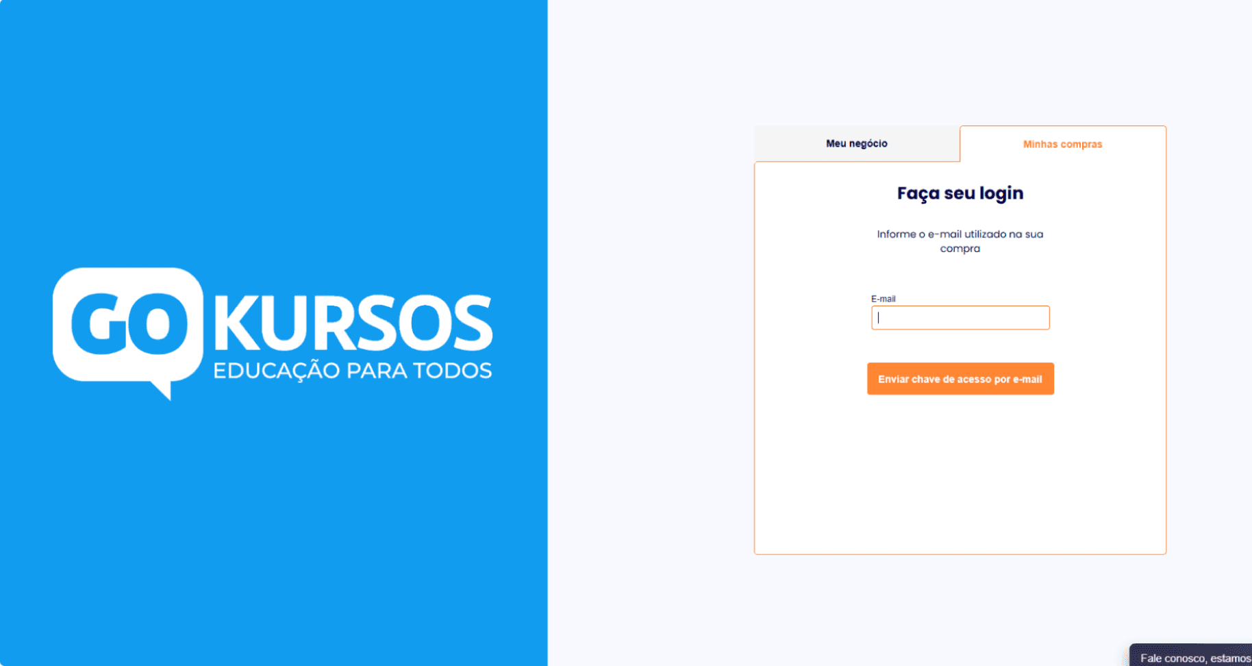
FIG. 1
Example of the outdated interface before the redesign.
PROCESS
How we got there
I structured the process around three main steps: understanding where the experience was breaking, using AI to explore directions faster, and defining design foundations before moving into the redesign.
01
Reviewing the Existing Experience
I started by reviewing the existing platform flows and mapping how creators and buyers moved through the experience. This helped me understand where the journey felt fragmented, which decisions users had to make, and where the main friction points appeared before the redesign.
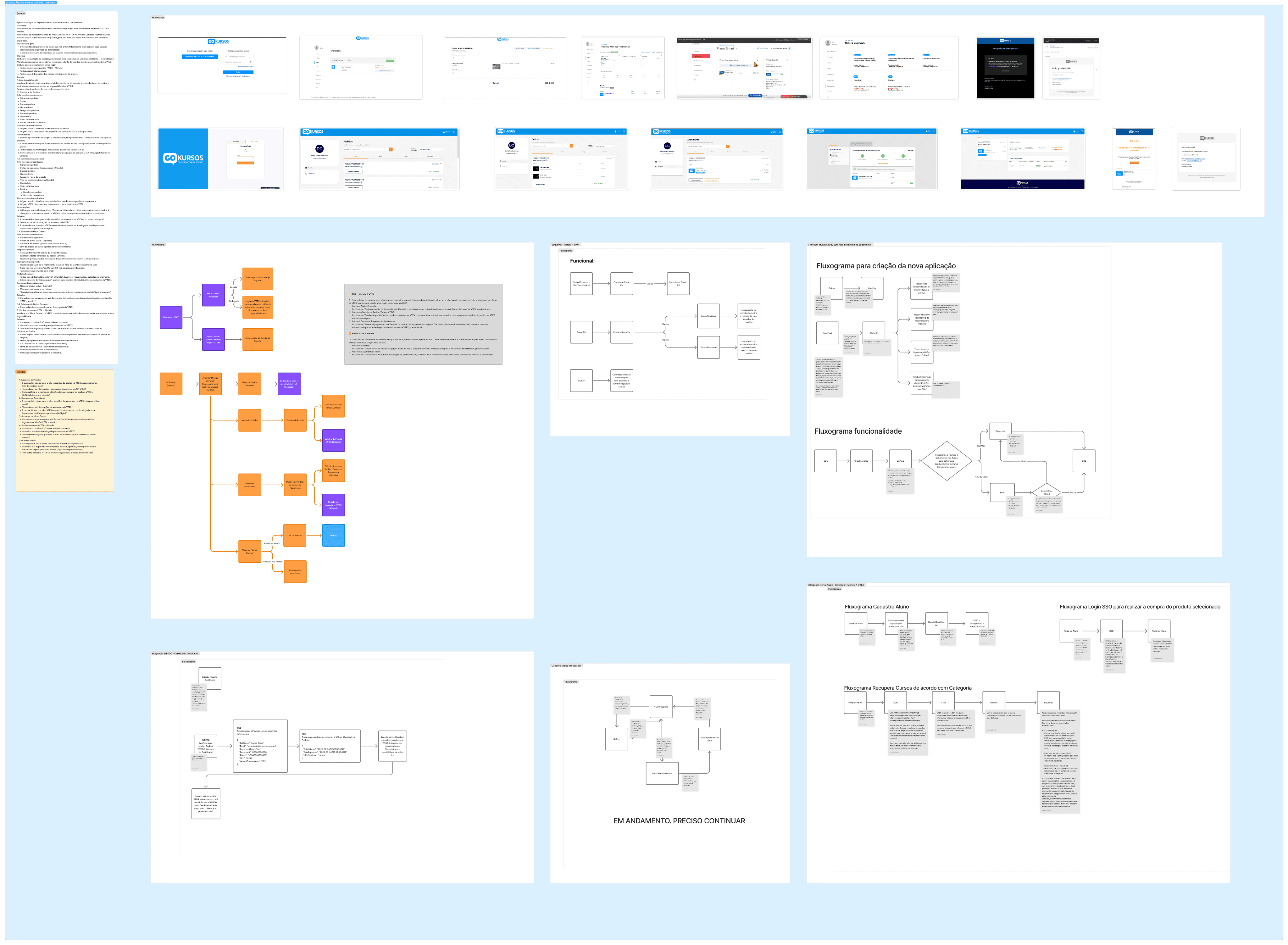
FIG. 2
Mapping existing flows and friction points.
02
Exploring Faster with AI
To speed up exploration, I used AI tools to generate layout ideas and interface directions early, testing more possibilities than the timeline would normally allow.
Generating was the easy part. I evaluated and rejected four AI-proposed layouts before reaching a viable direction, and the rejection criteria were exactly what the model couldn't know: the client's real context and what was technically feasible to build. AI proposed possibilities; deciding which one deserved to exist was still my job.
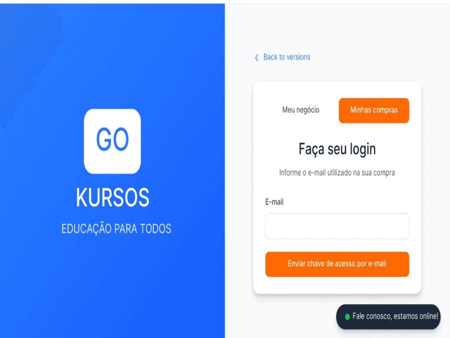
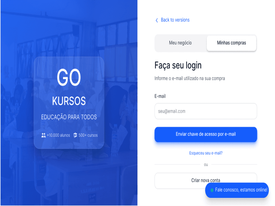
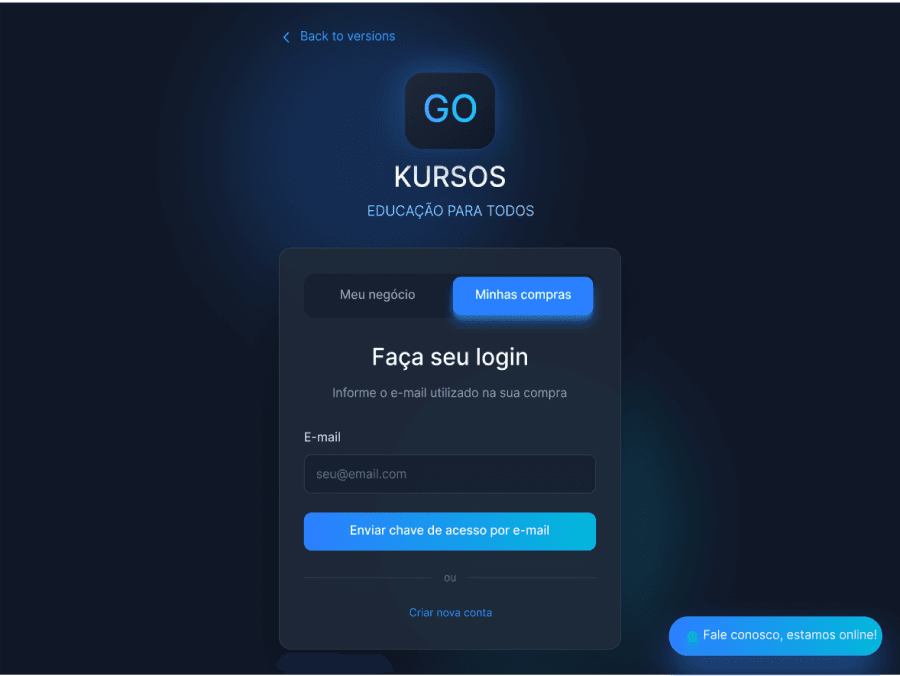
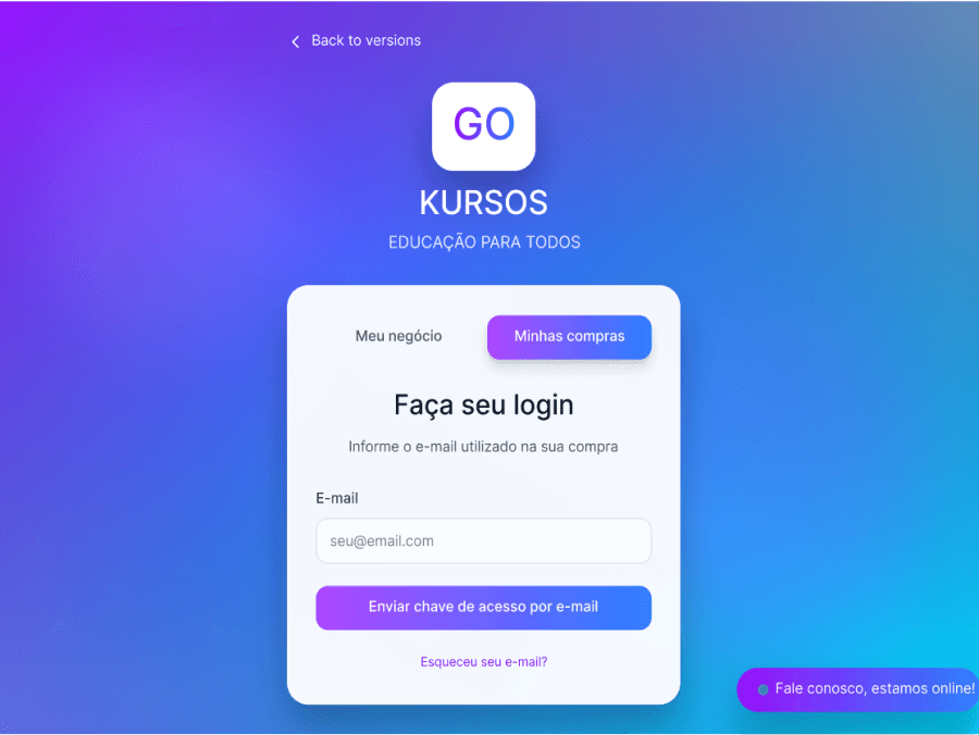
FIG. 3
Early interface explorations generated to quickly test layout directions.
03
Establishing the Design Foundations
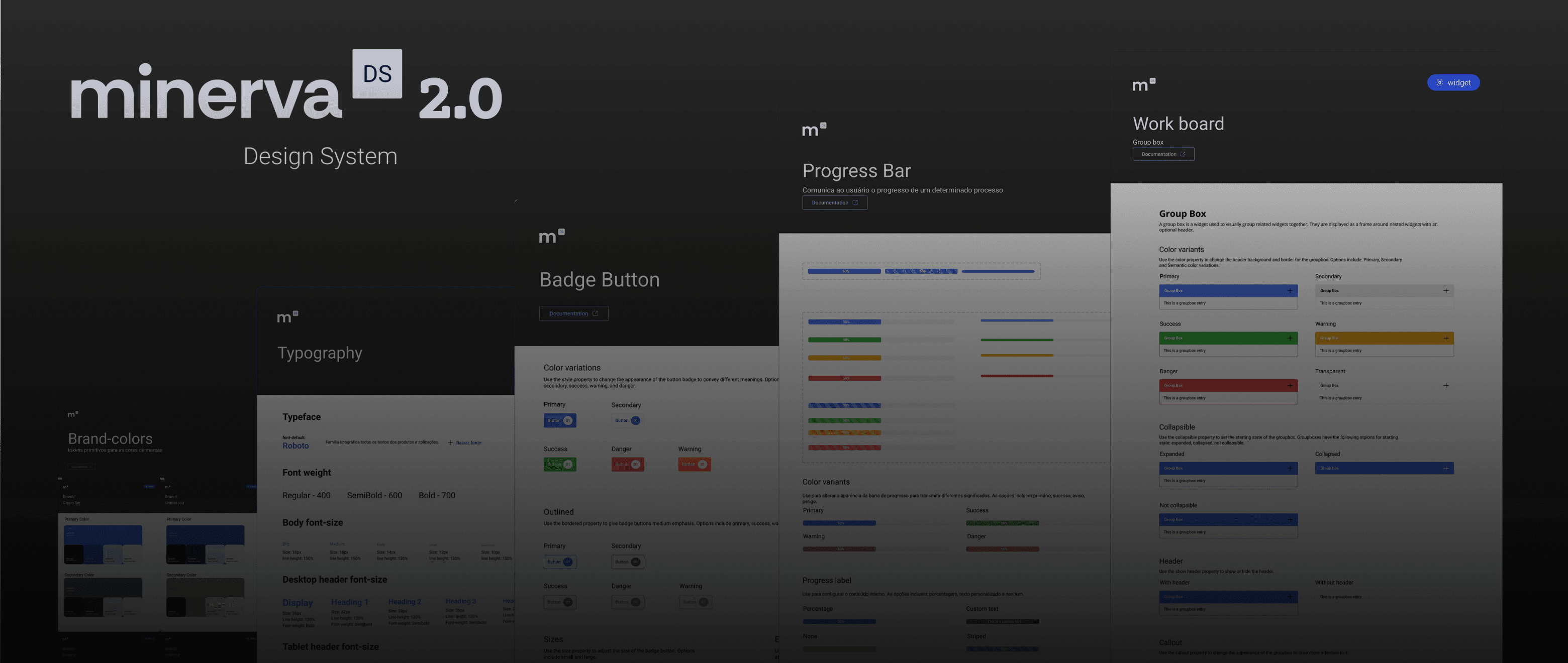
Before moving into the redesign, I defined a set of core design principles and visual foundations to guide the new experience. This helped ensure the solution stayed focused on clarity, usability, and a more modern and consistent product feel.
.
Clarity First
.
Consistency Across the Platform
.
Scalable Foundations
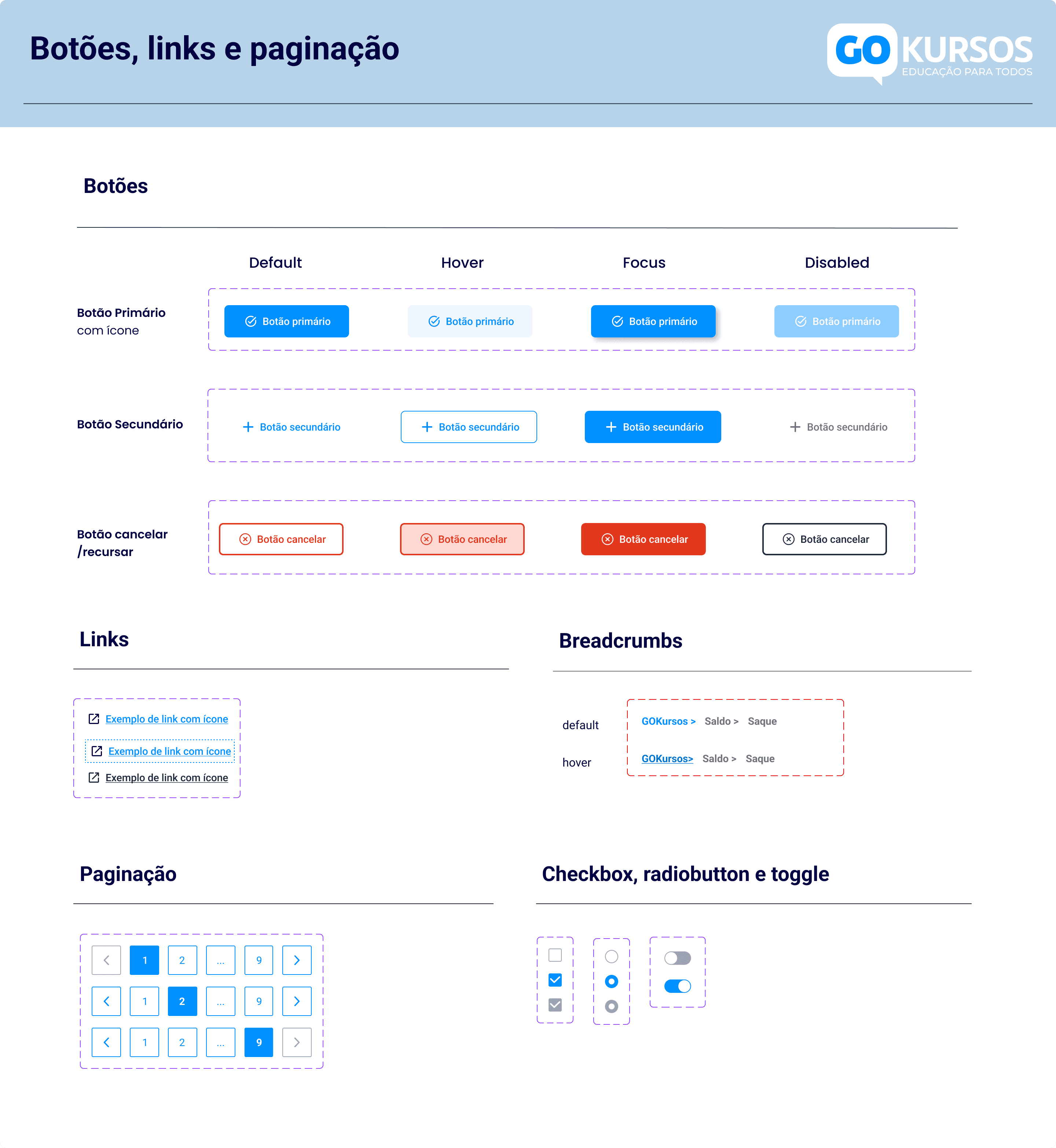
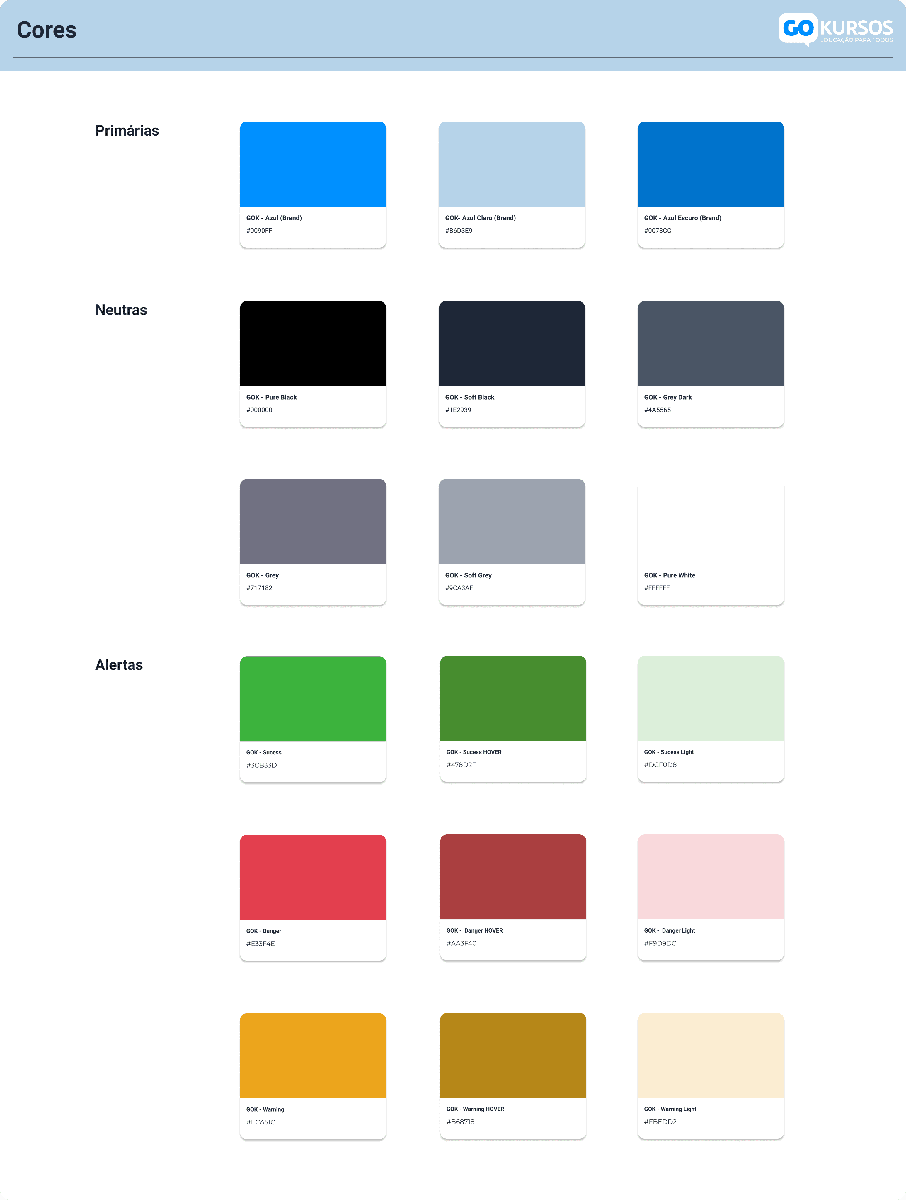
FIG. 4
Colors, components, and visual foundations.
The Solution
What we shipped
The redesign focused on simplifying the platform’s structure, modernizing the interface, and improving key flows for both creators and buyers. The goal was to create a faster, clearer experience while strengthening the product’s overall presence.
01
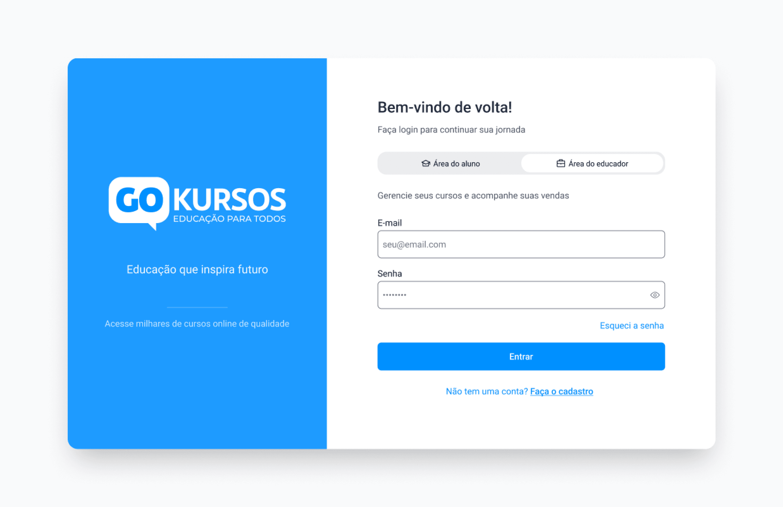
Modernized Login Experience
The login experience was redesigned to improve clarity, reduce visual clutter, and establish the new visual direction for the platform.
Before
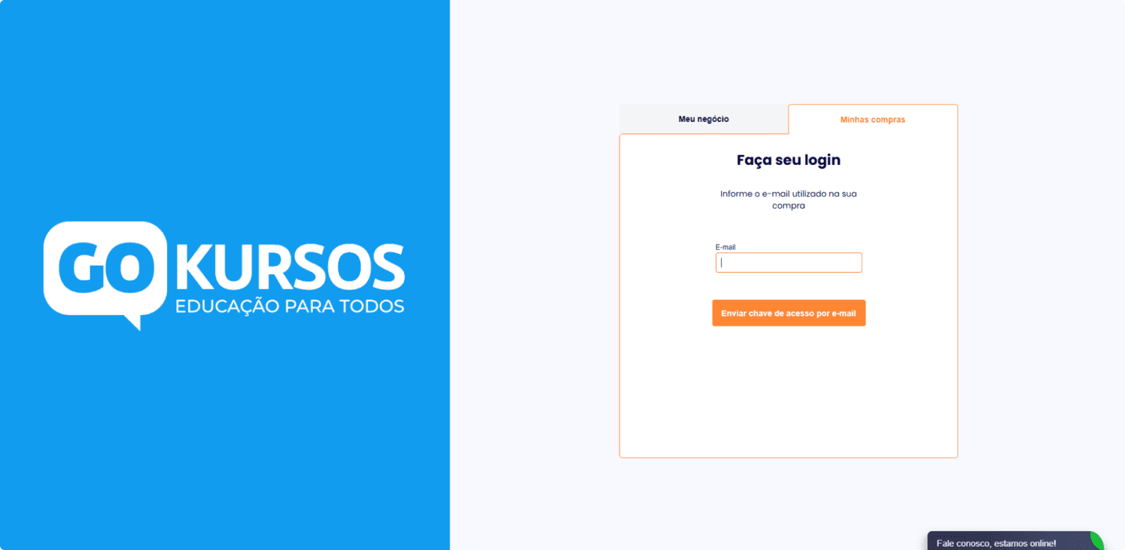
AFTER
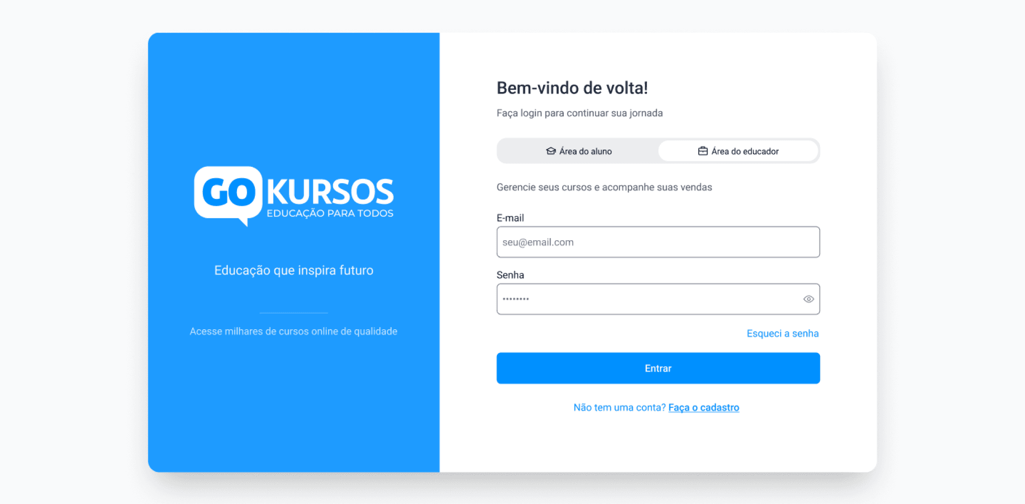
Clearer visual hierarchy
Stronger brand presence
Reduced interface clutter
02
Redesigned Dashboard Experience
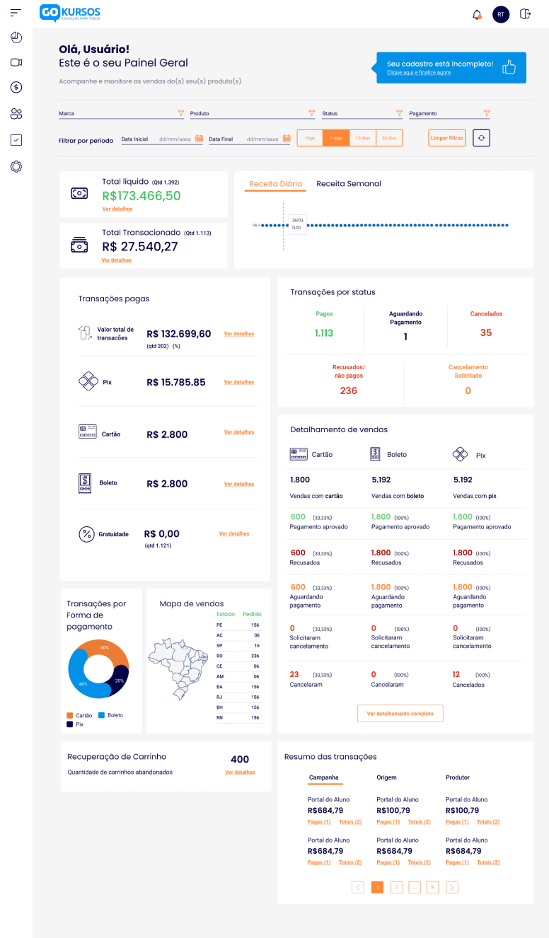
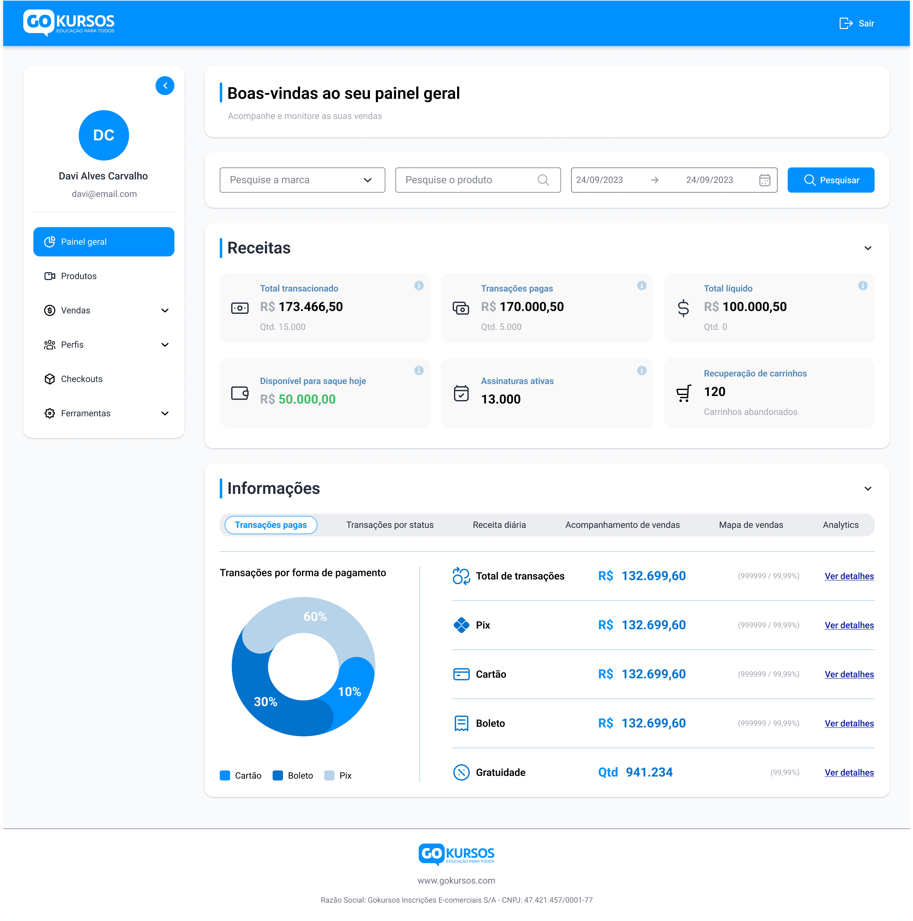
The original dashboard lacked structure and mixed too many elements together, making it difficult for users to quickly understand the most important information. The redesign separated content into clear tabs, prioritizing key metrics and making additional details accessible without cluttering the main view.
The client initially resisted the tab structure. Rather than argue in the abstract, I built both versions, the one requested and the one proposed, so the trade-offs became tangible. Seeing them side by side, and with developers confirming the performance gains, the client chose the proposed direction.
Before
AFTER
Prioritized key insights
Clearer information hierarchy
Organized access to additional details
03
Redesigned “My Courses” Experience
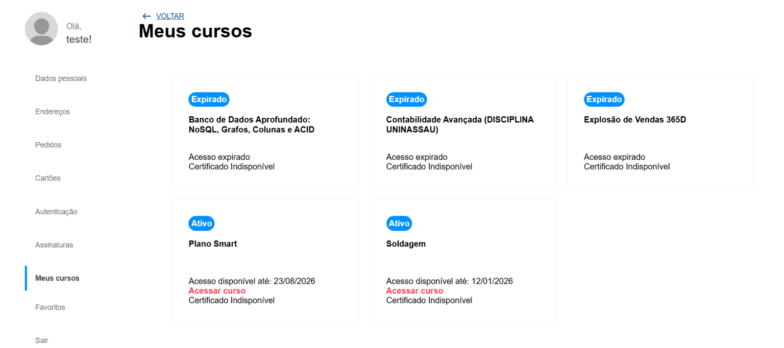
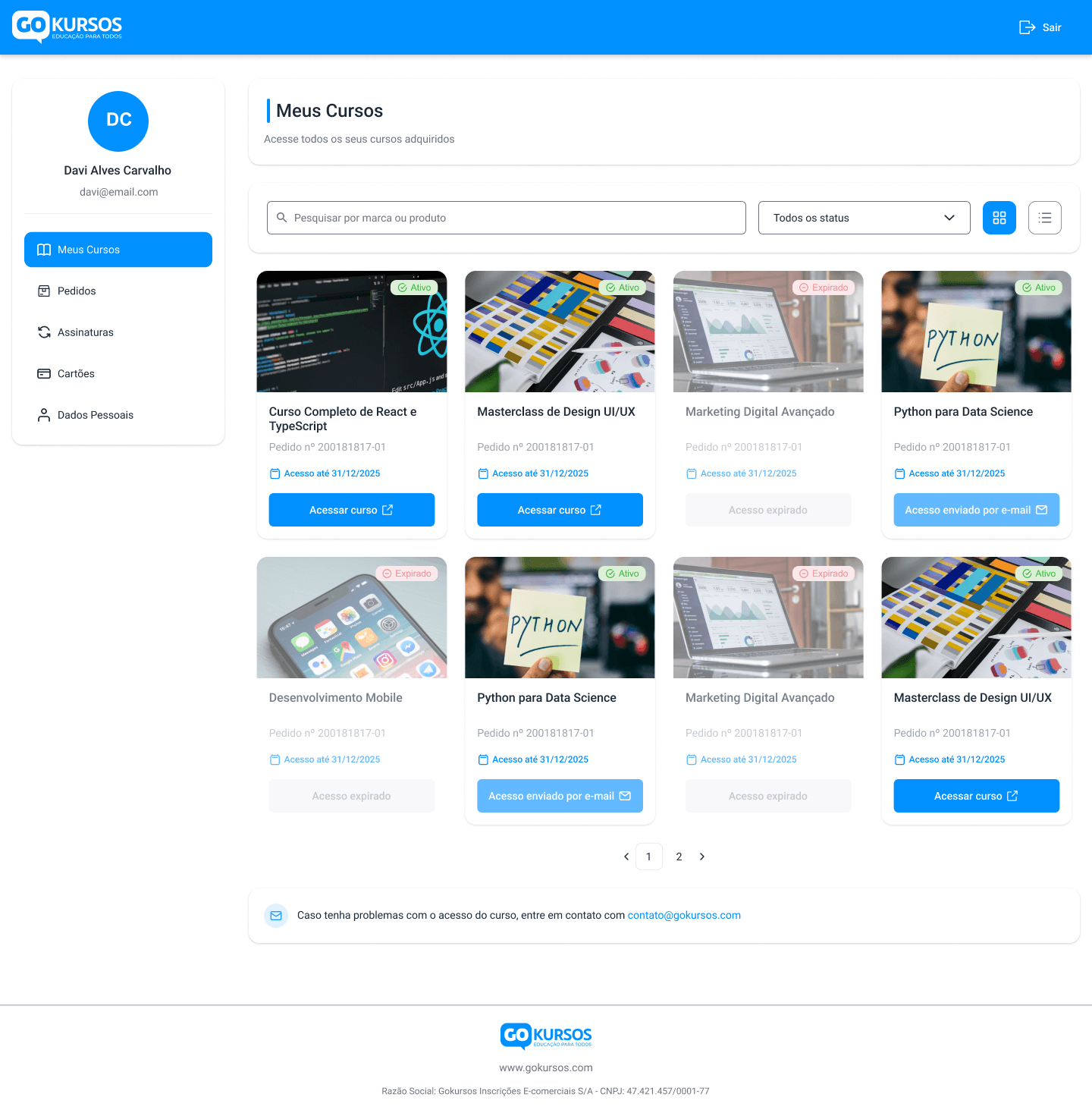
Accessing purchased courses previously required navigating to an external link outside the platform, creating a fragmented experience for buyers. The redesign integrated course access directly into the platform and introduced a structured layout with visual elements, making it much easier for users to find and open their courses.
Before
AFTER
Course access integrated into the platform
Clear course organization
One-click access to course links
04
Modernized Email Communication
The platform’s email communication used an outdated structure that lacked visual hierarchy and clarity. The redesign introduced a modern email layout with clearer content organization and stronger visual consistency with the platform.
Before
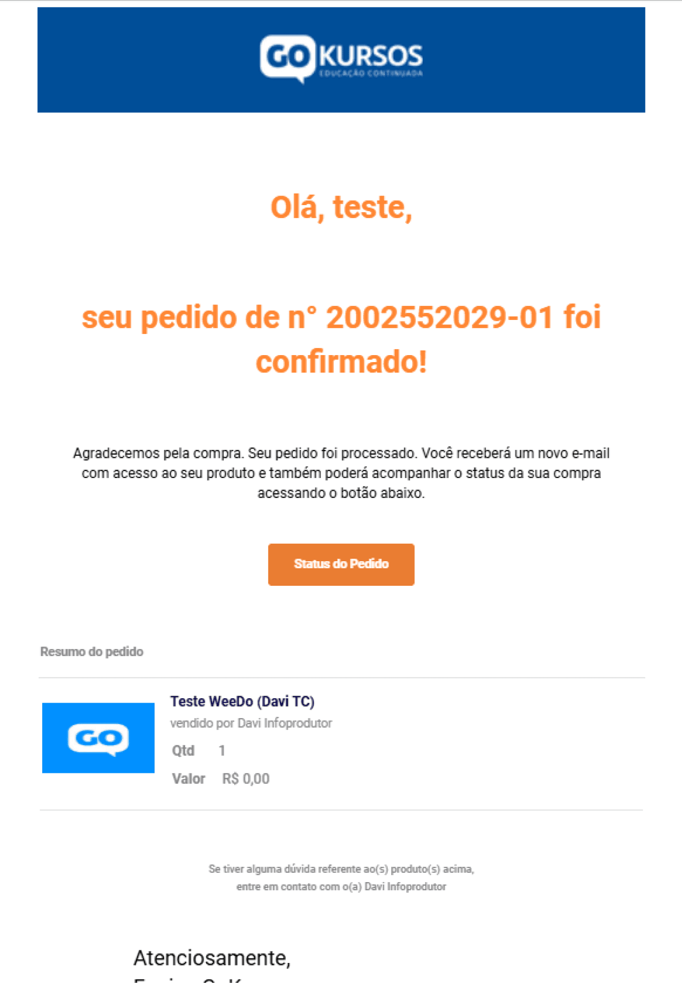
AFTER
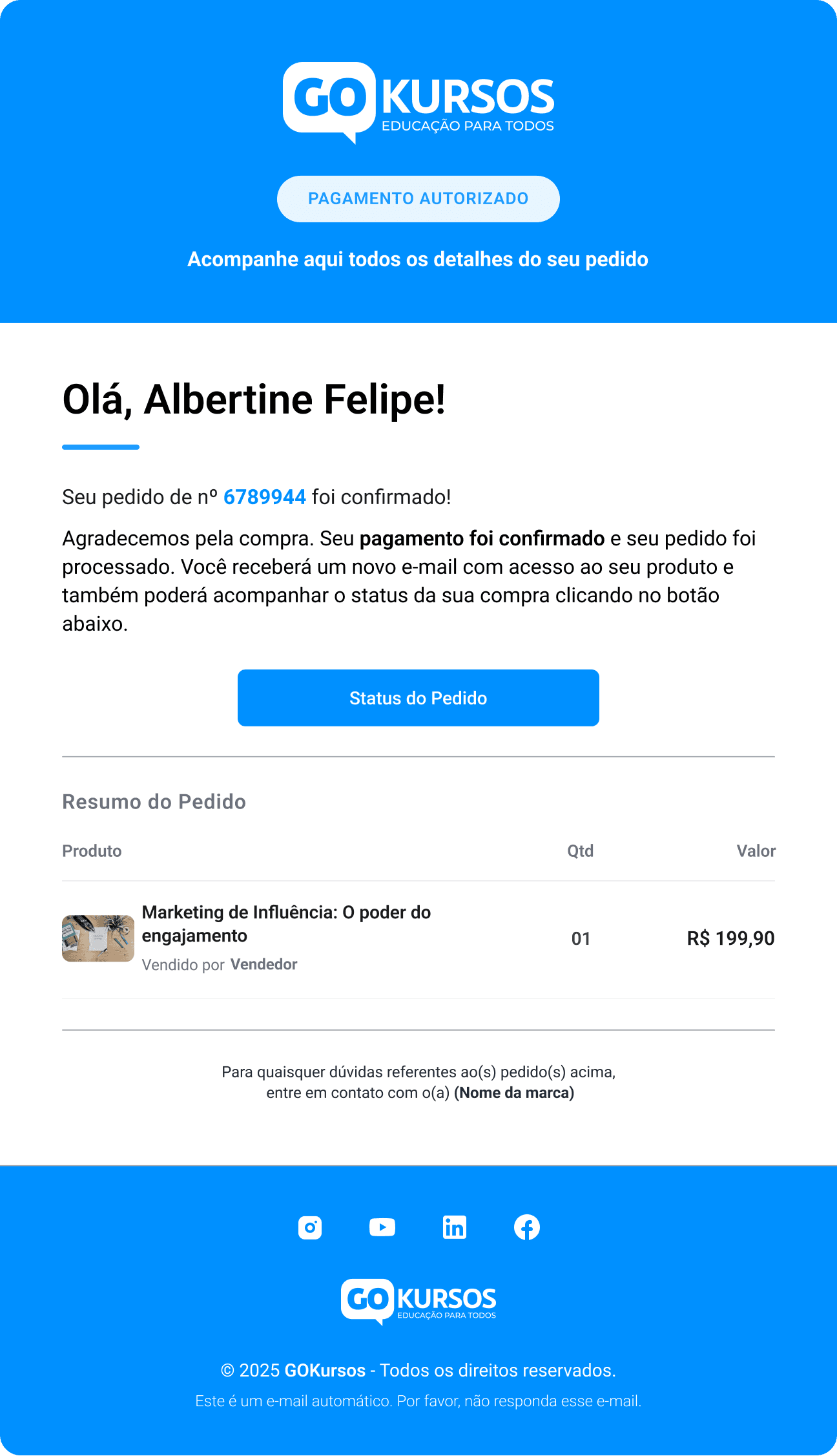
Modernized visual structure
Clearer content hierarchy
Consistent product communication
05
Expanding the New Experience
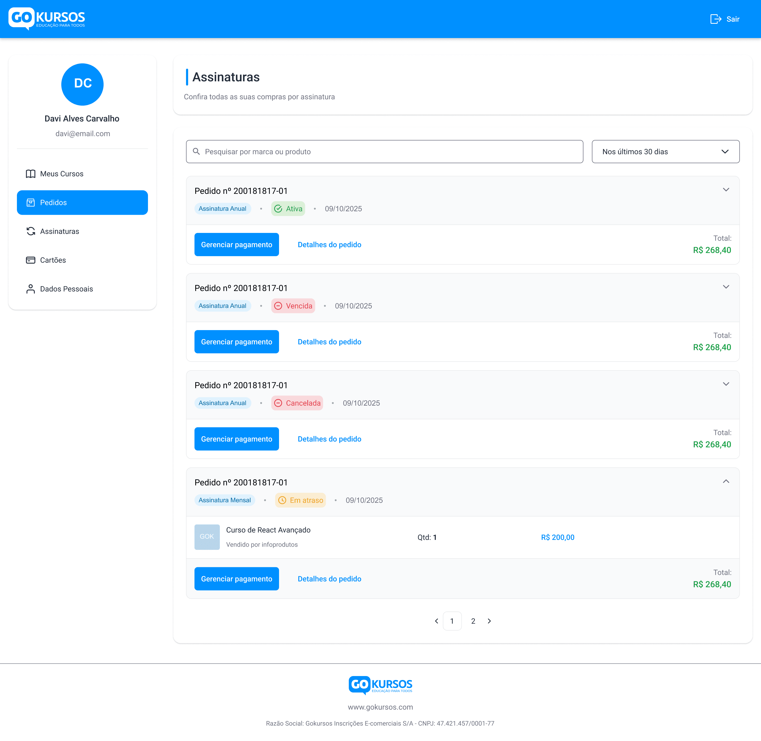
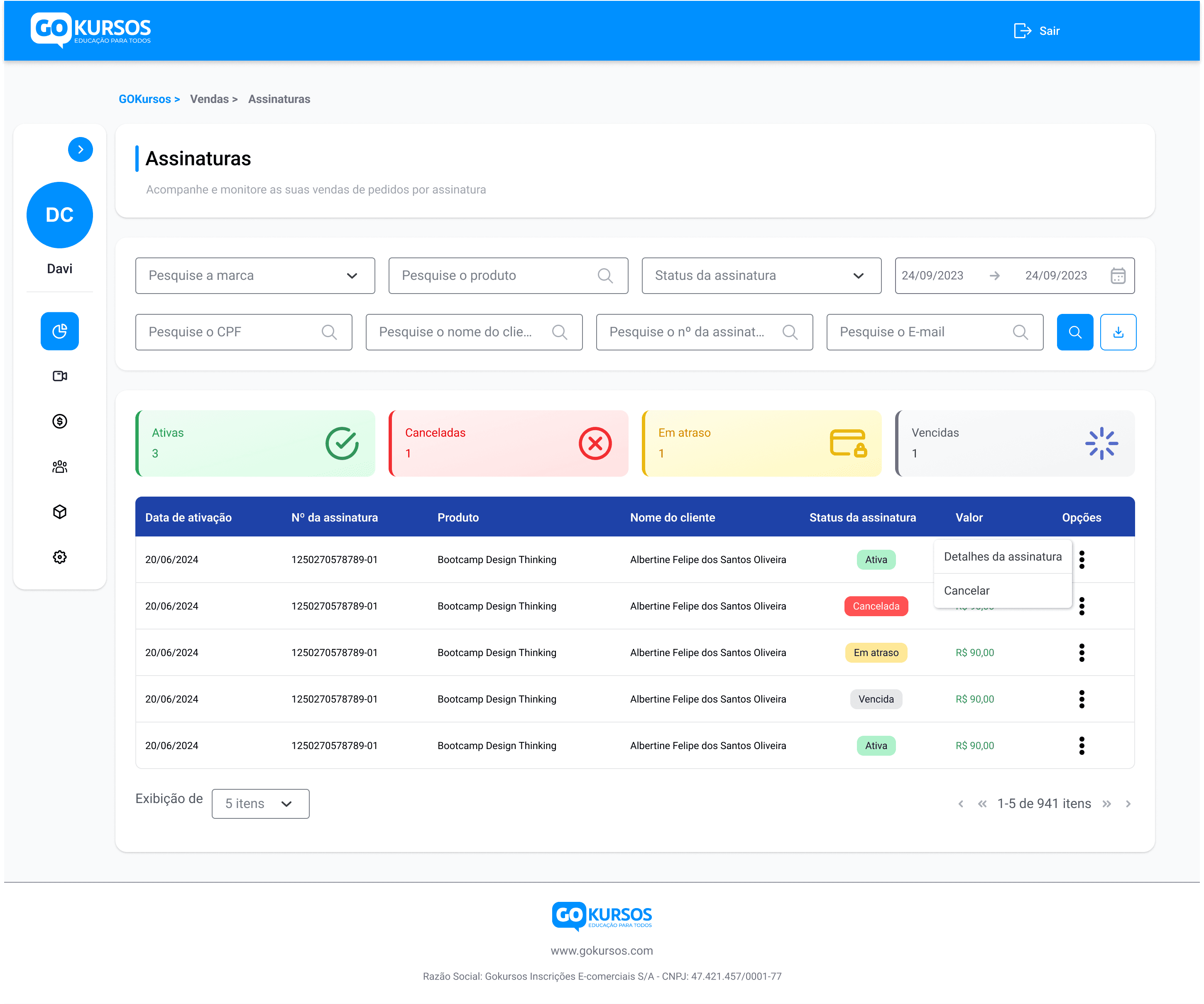
The redesign extended across the platform, bringing the new visual language and interaction patterns to products, subscriptions, and sales management screens.
AFTER
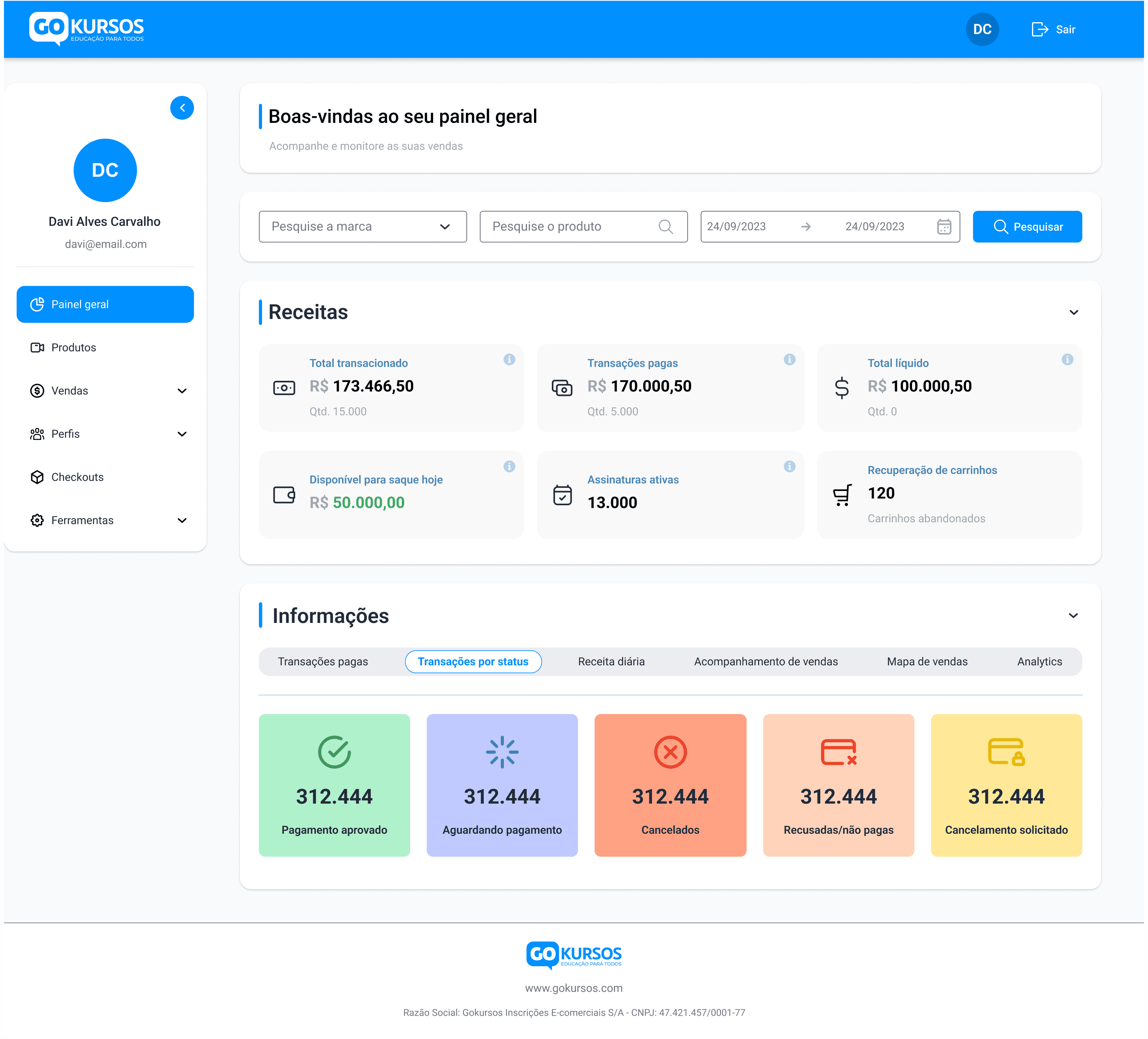
AFTER
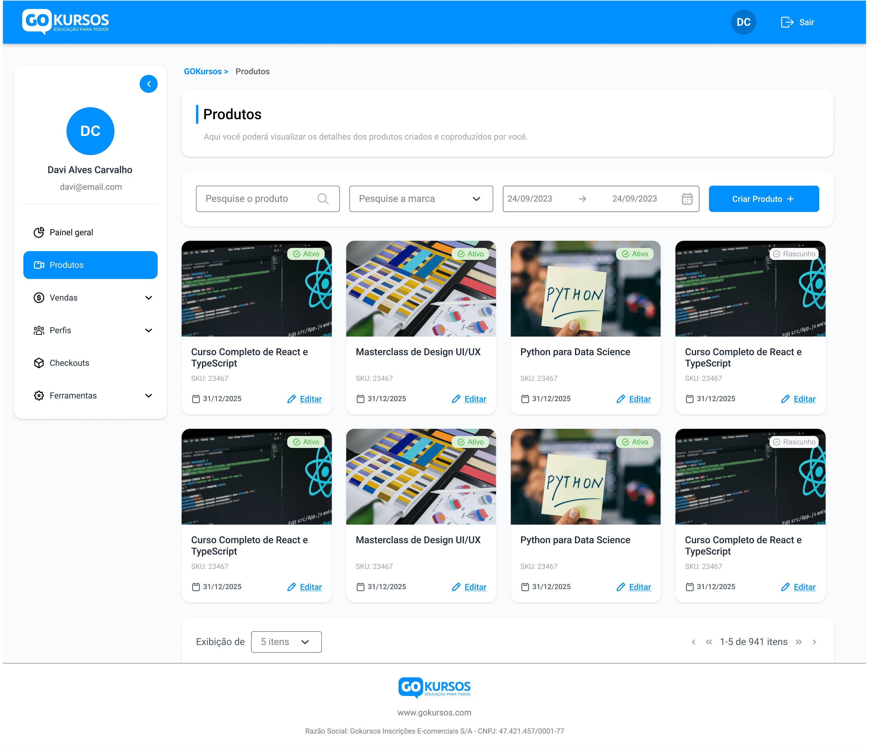
AFTER
AFTER
REFLECTION
Lessons from this project
What worked
The combination of structured problem analysis and rapid exploration allowed the team to move quickly without sacrificing clarity in the final solution. Using AI-assisted workflows helped accelerate early exploration, while defining clear design principles ensured the redesign stayed focused and consistent across the platform.
What I'd improve
Given more time, I would have conducted additional usability validation with real users after the redesign. While the new structure and flows addressed clear usability issues, testing the redesigned experience with buyers and sellers could have provided deeper insights and further refinements.
Key lesson
This project reinforced the importance of balancing speed with structure. Even when working under tight timelines, taking the time to define clear principles and foundations makes it possible to deliver faster while still creating a coherent and scalable product experience.
“What started as an urgent redesign became a project that showed me how AI can speed up exploration without replacing the clarity, judgment, and product thinking behind good design.”
Impact
What changed
Stronger product presence
Restored credibility and modernized the platform.
Clearer dashboard hierarchy
Organized key information to make the dashboard easier to scan.
1-click course access
Integrated course access directly into the platform.
Consistent UI foundations
Defined visual standards to support consistency across screens.
role
Lead Product Designer
timeline
~4 weeks
team
8-person team
(Design, Front-end,
Back-end, Product, QA)
tools
Figma Make, FigJam,
Claude, ChatGPT, Figma
platform
WEB/Mobile Platform
CASE STUDY 02
Rebuilding the Experience of an Infoproduct Platform
Redesigning an infoproduct marketplace that connects course creators and buyers, improving the experience for both sides of the platform while delivering the redesign twice as fast using AI-assisted workflows.
role
Lead Product Designer
timeline
~4 weeks
team
8-person team
(Design, Front-end,
Back-end, Product, QA)
tools
Figma Make, FigJam,
Claude, ChatGPT, Figma
platform
WEB/Mobile Platform
Problem
The platform connects course creators and buyers, enabling creators to sell digital products and users to access online courses. Over time, the experience became fragmented, with usability issues and an interface that no longer reflected the platform’s potential. The challenge was to redesign the product and bring clarity back to the experience.
My Role
I led the redesign as the only designer, working with a PO, PM, and five developers under a tight deadline. My focus was restructuring key flows for creators and buyers, using AI to accelerate exploration while keeping design judgment over what shipped.
Outcome
The redesign restored clarity and credibility to a product that had gone years without design attention. It launched immediately after testing, driven by client urgency and satisfaction with the result, with AI-assisted workflows compressing the timeline significantly.
The PROBLEM
Understanding the challenge
The platform looked like it had been maintained by developers alone for years: usability failures, a dated interface, and no visual signals of trust for new users. For a product handling payments, that absence of credibility was the real risk, and the company was losing clients because of it.
The company needed a fast redesign. To accelerate exploration I brought AI tools into my workflow, but speed alone wasn't the goal: I first needed to understand where the experience was breaking so the redesign could address the real problems.
FIG. 1
Example of the outdated interface before the redesign.
PROCESS
How we got there
I structured the process around three main steps: understanding where the experience was breaking, using AI to explore directions faster, and defining design foundations before moving into the redesign.
01
Reviewing the Existing Experience
I started by reviewing the existing platform flows and mapping how creators and buyers moved through the experience. This helped me understand where the journey felt fragmented, which decisions users had to make, and where the main friction points appeared before the redesign.
FIG. 2
Mapping existing flows and friction points.
02
Exploring Faster with AI
To speed up exploration, I used AI tools to generate layout ideas and interface directions early, testing more possibilities than the timeline would normally allow.
Generating was the easy part. I evaluated and rejected four AI-proposed layouts before reaching a viable direction, and the rejection criteria were exactly what the model couldn't know: the client's real context and what was technically feasible to build. AI proposed possibilities; deciding which one deserved to exist was still my job.
FIG. 3
Early interface explorations generated to quickly test layout directions.
03
Establishing the Design Foundations
Before moving into the redesign, I defined a set of core design principles and visual foundations to guide the new experience. This helped ensure the solution stayed focused on clarity, usability, and a more modern and consistent product feel.
.
Clarity First
.
Consistency Across the Platform
.
Scalable Foundations
FIG. 4
Colors, components, and visual foundations.
The Solution
What we shipped
The redesign focused on simplifying the platform’s structure, modernizing the interface, and improving key flows for both creators and buyers. The goal was to create a faster, clearer experience while strengthening the product’s overall presence.
01
Modernized Login Experience
The login experience was redesigned to improve clarity, reduce visual clutter, and establish the new visual direction for the platform.
Before
AFTER
Clearer visual hierarchy
Stronger brand presence
Reduced interface clutter
02
Redesigned Dashboard Experience
The original dashboard lacked structure and mixed too many elements together, making it difficult for users to quickly understand the most important information. The redesign separated content into clear tabs, prioritizing key metrics and making additional details accessible without cluttering the main view.
The client initially resisted the tab structure. Rather than argue in the abstract, I built both versions, the one requested and the one proposed, so the trade-offs became tangible. Seeing them side by side, and with developers confirming the performance gains, the client chose the proposed direction.
Before
AFTER
Prioritized key insights
Clearer information hierarchy
Organized access to additional details
03
Redesigned “My Courses” Experience
Accessing purchased courses previously required navigating to an external link outside the platform, creating a fragmented experience for buyers. The redesign integrated course access directly into the platform and introduced a structured layout with visual elements, making it much easier for users to find and open their courses.
Before
AFTER
Course access integrated into the platform
Clear course organization
One-click access to course links
04
Modernized Email Communication
The platform’s email communication used an outdated structure that lacked visual hierarchy and clarity. The redesign introduced a modern email layout with clearer content organization and stronger visual consistency with the platform.
Before
AFTER
Modernized visual structure
Clearer content hierarchy
Consistent product communication
05
Expanding the New Experience
The redesign extended across the platform, bringing the new visual language and interaction patterns to products, subscriptions, and sales management screens.
AFTER
AFTER
AFTER
AFTER
Impact
What changed
Stronger product presence
Restored credibility and modernized the platform.
Clearer dashboard hierarchy
Organized key information to make the dashboard easier to scan.
1-click course access
Integrated course access directly into the platform.
Consistent UI foundations
Defined visual standards to support consistency across screens.
REFLECTION
Lessons from this project
What worked
The combination of structured problem analysis and rapid exploration allowed the team to move quickly without sacrificing clarity in the final solution. Using AI-assisted workflows helped accelerate early exploration, while defining clear design principles ensured the redesign stayed focused and consistent across the platform.
What I'd improve
Given more time, I would have conducted additional usability validation with real users after the redesign. While the new structure and flows addressed clear usability issues, testing the redesigned experience with buyers and sellers could have provided deeper insights and further refinements.
Key lesson
This project reinforced the importance of balancing speed with structure. Even when working under tight timelines, taking the time to define clear principles and foundations makes it possible to deliver faster while still creating a coherent and scalable product experience.
“What started as an urgent redesign became a project that showed me how AI can speed up exploration without replacing the clarity, judgment, and product thinking behind good design.”
© 2026 Albertine Felipe
CASE STUDY 02
Rebuilding the Experience of an Infoproduct Platform
Redesigning an infoproduct marketplace that connects course creators and buyers, improving the user experience for both sides of the platform while delivering the redesign 4× faster using AI-assisted workflows.
Problem
The platform connects course creators and buyers, enabling creators to sell digital products and users to access online courses. Over time, the experience became fragmented, with usability issues and an interface that no longer reflected the platform’s potential. The challenge was to redesign the product and bring clarity back to the experience.
My Role
I led the redesign as the only designer, working with a PO, PM, and five developers under a tight deadline. My focus was restructuring key flows for creators and buyers, using AI to accelerate exploration while keeping design judgment over what shipped.
Outcome
The redesign restored clarity and credibility to a product that had gone years without design attention. It launched immediately after testing, driven by client urgency and satisfaction with the result, with AI-assisted workflows compressing the timeline significantly.
The PROBLEM
Understanding the challenge
The platform had an outdated interface that no longer matched user expectations for modern digital products. As the experience became harder to navigate and visually dated, the product started losing credibility and clients.
The company needed a fast redesign to modernize the platform and restore confidence in the product.
To accelerate exploration, I incorporated AI tools into my workflow. But speed alone wasn’t the goal — I first needed to understand where the experience was breaking so the redesign could address the real problems.
FIG. 1
Example of the outdated interface before the redesign.
PROCESS
How we got there
I structured the process around three main steps: understanding where the experience was breaking, using AI to explore directions faster, and defining design foundations before moving into the redesign.
01
Reviewing the Existing Experience
I started by reviewing the existing platform flows and mapping how creators and buyers moved through the experience. This helped me understand where the journey felt fragmented, which decisions users had to make, and where the main friction points appeared before the redesign.
FIG. 2
Mapping existing flows and friction points.
02
Exploring Faster with AI
To speed up exploration, I used AI tools to generate layout ideas and interface directions early, testing more possibilities than the timeline would normally allow.
Generating was the easy part. I evaluated and rejected four AI-proposed layouts before reaching a viable direction, and the rejection criteria were exactly what the model couldn't know: the client's real context and what was technically feasible to build. AI proposed possibilities; deciding which one deserved to exist was still my job.
FIG. 3
Early interface explorations generated to quickly test layout directions.
03
Establishing the Design Foundations
Before moving into the redesign, I defined a set of core design principles and visual foundations to guide the new experience. This helped ensure the solution stayed focused on clarity, usability, and a more modern and consistent product feel.
.
Clarity First
.
Consistency Across the Platform
.
Scalable Foundations
FIG. 3
Colors, components, and visual foundations.
The Solution
What we shipped
The redesign focused on simplifying the platform’s structure, modernizing the interface, and improving key flows for both creators and buyers. The goal was to create a faster, clearer experience while strengthening the product’s overall presence.
01
Modernized Login Experience
The login experience was redesigned to improve clarity, reduce visual clutter, and establish the new visual direction for the platform.
Before
AFTER
Clearer visual hierarchy
Stronger brand presence
Reduced interface clutter
02
Redesigned Dashboard Experience
The original dashboard lacked structure and mixed too many elements together, making it difficult for users to quickly understand the most important information. The redesign focused on organizing content, prioritizing key metrics, and making additional details accessible without cluttering the main view.
Before
AFTER
Prioritized key insights
Clearer information hierarchy
Organized access to additional details
03
Redesigned “My Courses” Experience
Accessing purchased courses previously required navigating to an external link outside the platform, creating a fragmented experience for buyers. The redesign integrated course access directly into the platform and introduced a structured layout with visual elements, making it much easier for users to find and open their courses.
Before
AFTER
Course access integrated into the platform
Clear course organization
One-click access to course links
04
Modernized Email Communication
The platform’s email communication used an outdated structure that lacked visual hierarchy and clarity. The redesign introduced a modern email layout with clearer content organization and stronger visual consistency with the platform.
Before
AFTER
Modernized visual structure
Clearer content hierarchy
Consistent product communication
05
Expanding the New Experience
The redesign extended across multiple areas of the platform, bringing the new visual language and interaction patterns to additional screens.
AFTER
AFTER
AFTER
AFTER
Impact
Measurable results
Stronger product presence
Modernized the platform experience and improved credibility.
Clearer dashboard hierarchy
Organized key information to make the dashboard easier to scan.
1-click course access
Integrated course access directly into the platform.
Consistent UI foundations
Defined visual standards to support consistency across screens.
role
Lead Product Designer
timeline
~4 weeks
team
8-person team (Design, Front-end, Back-end, Product, QA)
tools
Figma Make, FigJam, Claude, ChatGPT, Figma
platform
WEB/Mobile Platform
REFLECTION
Lessons from this project
What worked
The combination of structured problem analysis and rapid exploration allowed the team to move quickly without sacrificing clarity in the final solution. Using AI-assisted workflows helped accelerate early exploration, while defining clear design principles ensured the redesign stayed focused and consistent across the platform.
What I'd improve
Given more time, I would have conducted additional usability validation with real users after the redesign. While the new structure and flows addressed clear usability issues, testing the redesigned experience with buyers and sellers could have provided deeper insights and further refinements.
Key lesson
This project reinforced the importance of balancing speed with structure. Even when working under tight timelines, taking the time to define clear principles and foundations makes it possible to deliver faster while still creating a coherent and scalable product experience.
“What started as an urgent redesign became a project that showed me how AI can speed up exploration without replacing the clarity, judgment, and product thinking behind good design.”
© 2026 Albertine Felipe