CASE STUDY 01
Simplifying Event Creation and Seat Selection for Digital Creators
Designing a new event experience across web and mobile that opened a new monetization channel for the platform while simplifying complex setup, ticketing, and seat selection flows.


Macbook Pro Mockup



iPhone
Mockup



© 2026 Albertine Felipe
Problem
GoExplosion needed a new product experience that allowed creators to sell events, not only digital products. The main challenge was simplifying a complex flow involving ticket setup, pricing, seat selection, and availability while still giving creators enough control to manage different event formats.
My Role
I led the UX and UI design of the event creation flow, from mapping the product logic to designing the main creator and buyer interactions. My focus was to reduce complexity, organize the setup process, and make the experience easier to understand across both sides of the platform.
Outcome
The solution introduced a new event creation experience that opened a new monetization channel for the platform, supporting events in arenas from 2,000 to 20,000 seats. It also connected creator-side configuration with a clearer buyer experience across web and mobile.
The PROBLEM
Understanding the challenge
Creating events was more than a simple form. The experience needed to support ticket rules, pricing options, seat selection, availability, and buyer access while still feeling simple for creators to use.
There was also little internal precedent to lean on: the seat map would live inside the seats.io API, and nobody on the team knew yet what it would allow us to control. So before touching interface design, I mapped the main rules and flows behind event creation, turning a large product opportunity into a structure I could actually make decisions against.
The real challenge was reducing complexity without removing flexibility.
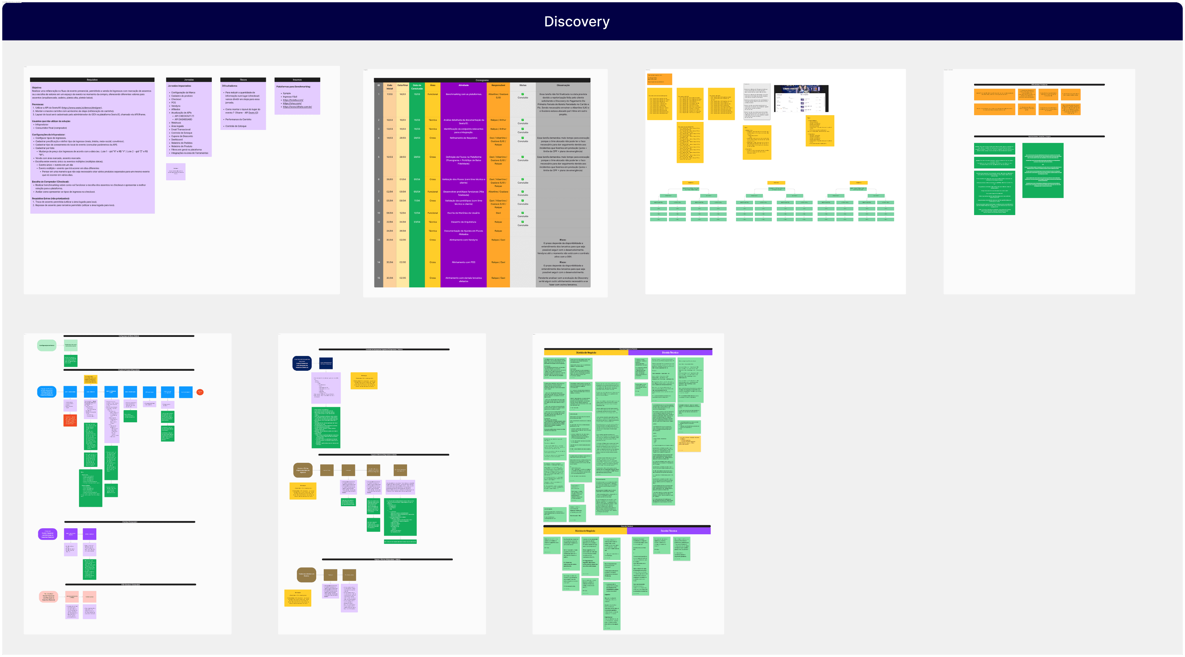
FIG. 1
Initial discovery and flow mapping used to understand the event creation logic.
PROCESS
How we got there
The process focused on adapting the existing event flow, understanding the seats.io integration, and structuring complex event rules into a clearer experience.
01
Adapting the Existing Event Flow
The platform already had a flow for creating standard events, which I had previously designed. I started by reviewing that structure and identifying what needed to change to support events with seat selection, ticket rules, pricing, and availability. Benchmarking similar products also helped me understand common patterns and opportunities to simplify the experience.
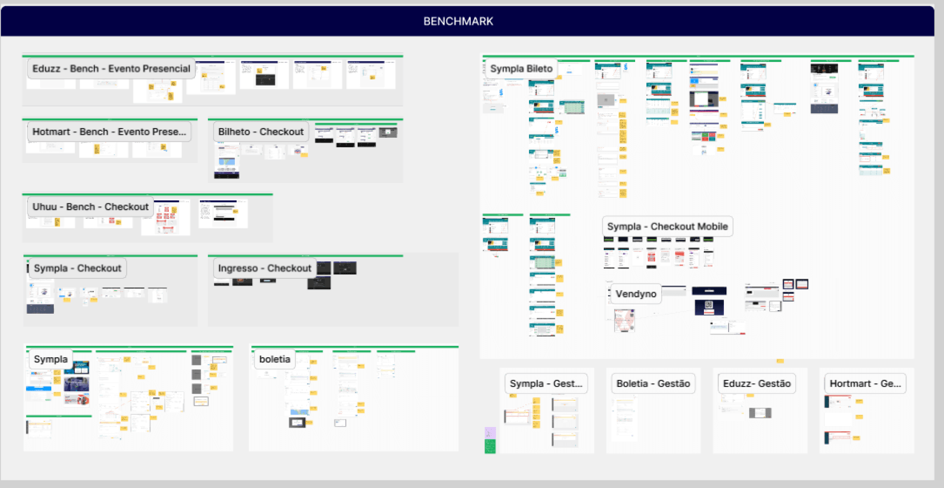
FIG. 2
Existing flow review and benchmarking.
02
Understanding the seats.io Integration
Because the seat map would be created and managed through the seats.io API, I needed to understand how the tool worked, what was technically possible, and how its limitations would affect the user experience. This helped shape a flow that was both usable for creators and realistic to implement.
The first step was defining which parts of the experience each system would own:
.
Create seat map (seats.io)
.
Connect map to ticket types (seats.io)
.
Define availability and pricing (goexplosion)
.
Buyer selects seat during checkout (goexplosion)
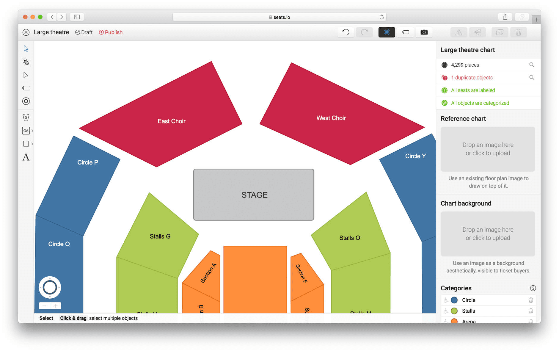
FIG. 3
Seats.io integration logic.
03
Structuring the Creation Flow
After understanding the business rules, benchmarks, and technical constraints, I organized the experience into clear steps so creators could configure complex event details progressively instead of dealing with everything at once.
Each step owned one decision and worked independently of event type. That independence was deliberate: when seat selection arrived later, it entered as its own step without forcing changes to the existing flow.
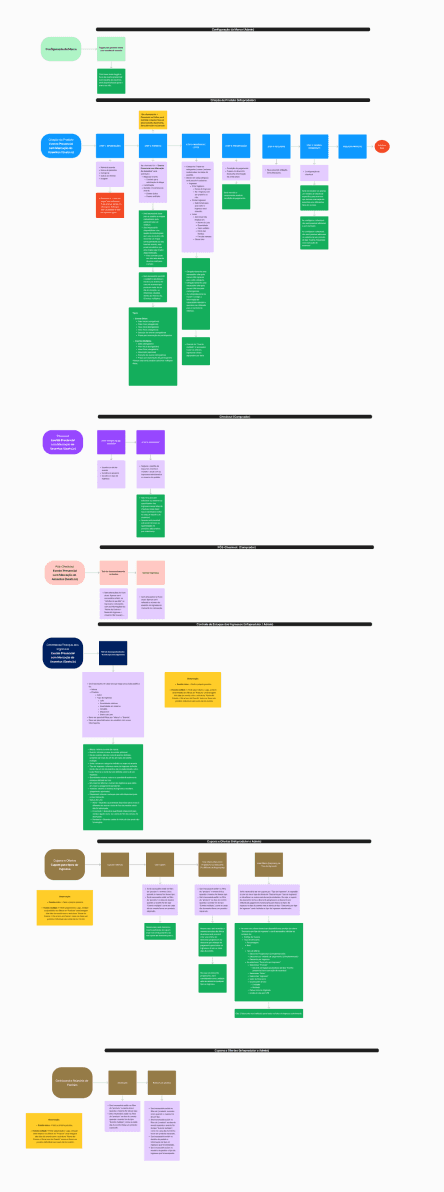
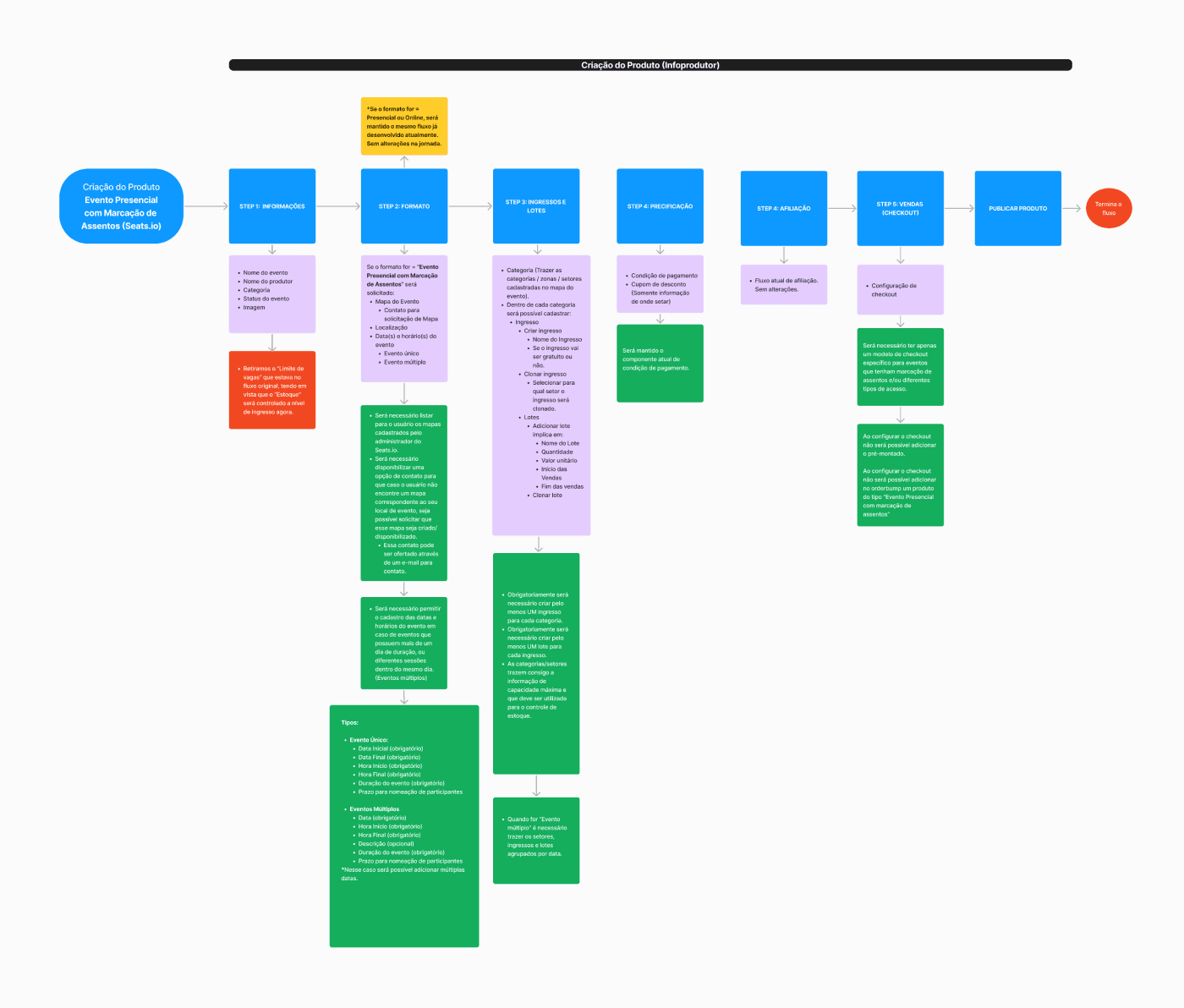
FIG. 4
Organizing complex setup rules into a clearer creation flow
The Solution
What we shipped
We designed a new event creation experience that turned a complex business opportunity into a structured product flow. The solution connected event setup, seat selection, ticket rules, pricing, and the buyer experience into one coherent journey.
01
Creating Complex Events Without Overwhelming Creators
The event creation flow was organized progressively so creators could configure advanced event details without facing every decision at once. Instead of treating the setup like a long form, the experience guided users through the right sequence of decisions.
The hardest call in this step was seat map creation. Technically, creators could have built their own maps, but combining map creation with ticket rules was too much complexity for a task that has always belonged to specialized teams. I chose to offer pre-built maps and route custom requests through support, trading creator autonomy for reliability at the moment of sale.
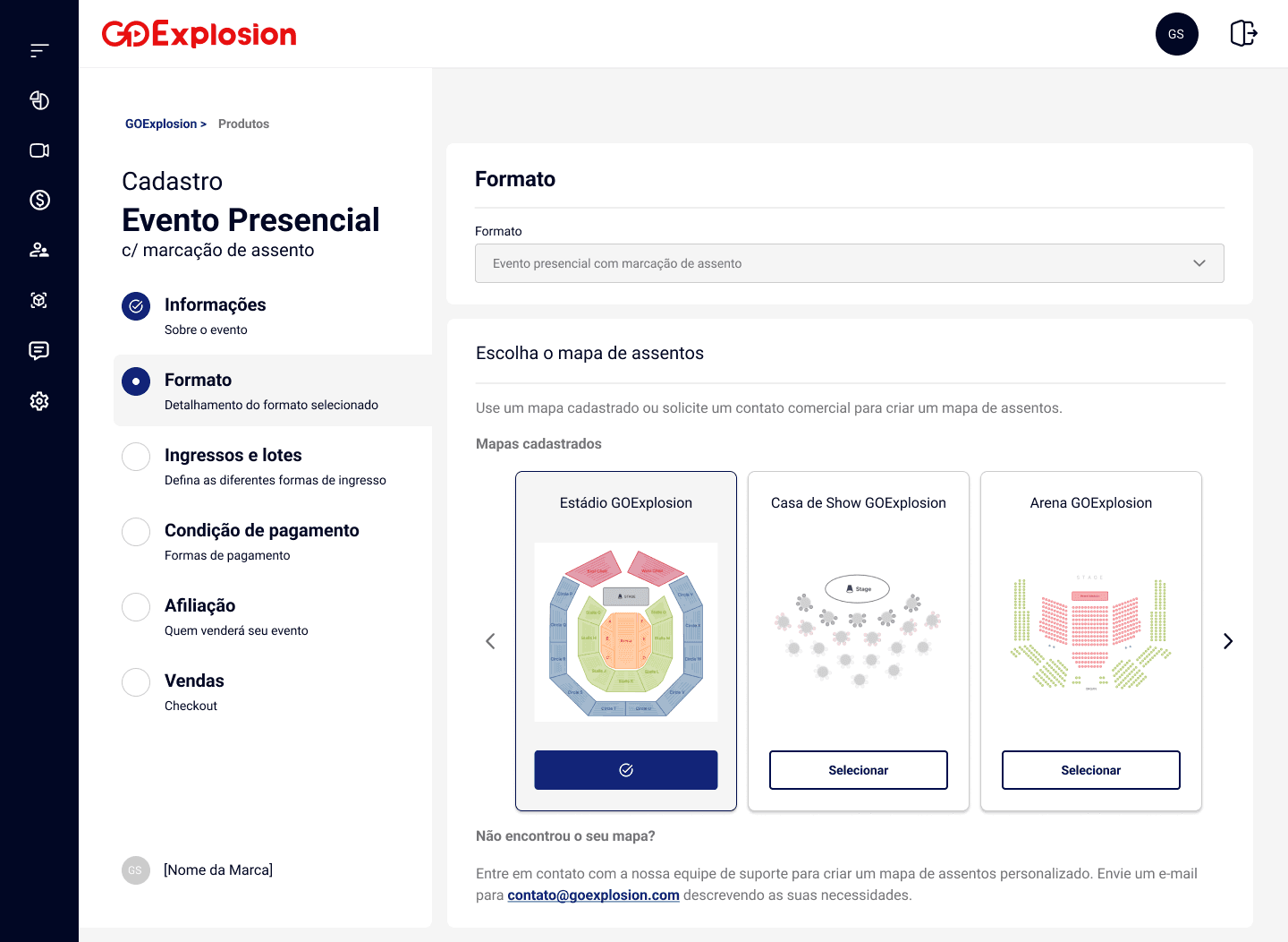
Pre-built maps
Guided event setup
Progressive configuration
Lower setup complexity
02
Connecting Map Selection to the Event Setup
Choosing a map was only the beginning. Each map carried its own sectors and capacities, and those needed to connect with ticket types, batches, pricing, and availability rules. The design challenge was making those relationships visible so creators understood what each choice meant for their event.
.
Map selection connected to tickets
.
Clearer seat availability logic
.
Better control over event setup
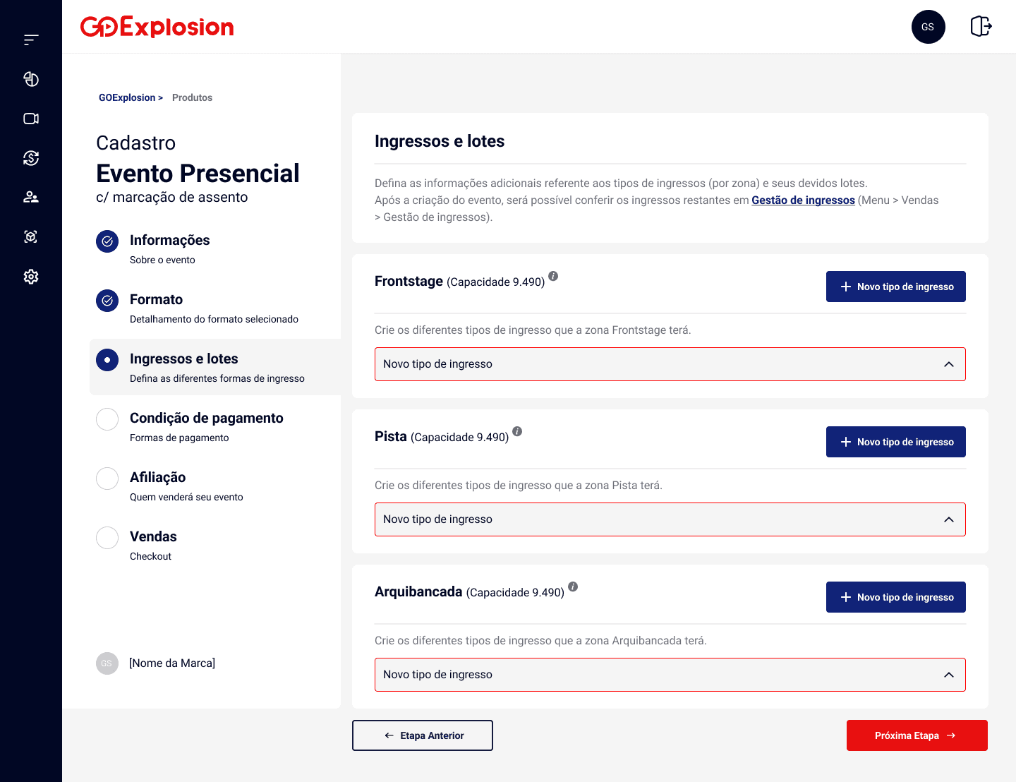
To make the setup easier to understand, I broke down how each part of the selected map would behave inside the event flow. The seat map was not just a visual choice: it needed to connect with ticket types, batches, sales periods, free ticket options, and availability rules.
This helped clarify what creators needed to configure and how those decisions would affect the buyer experience later.
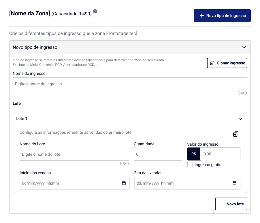
Add new ticket
Duplicate ticket info
Duplicate Bacth Info
Batch Price
New batch
Sales period
Batch Name
Info Map Selection
Ticket Name
03
Managing Tickets, Lots, and Pricing Rules
Ticket and pricing management needed to support different event strategies without making the setup confusing. I organized ticket types, lots, pricing, sales periods, and availability rules into a clearer structure so creators could manage how each event would be sold.
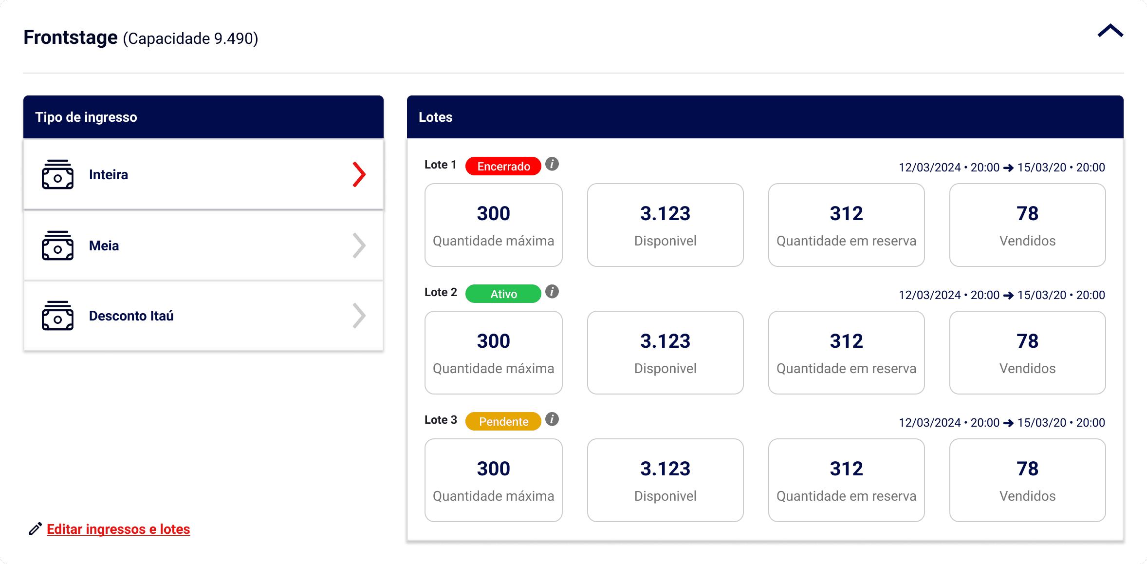
Batch Selling Period
Batch Selling Info
Batches
Ticket Types
Edit Tickets and Batches
Organized ticket management
Flexible pricing setup
Clear sales period control
04
Creating a Clearer Path to Purchase
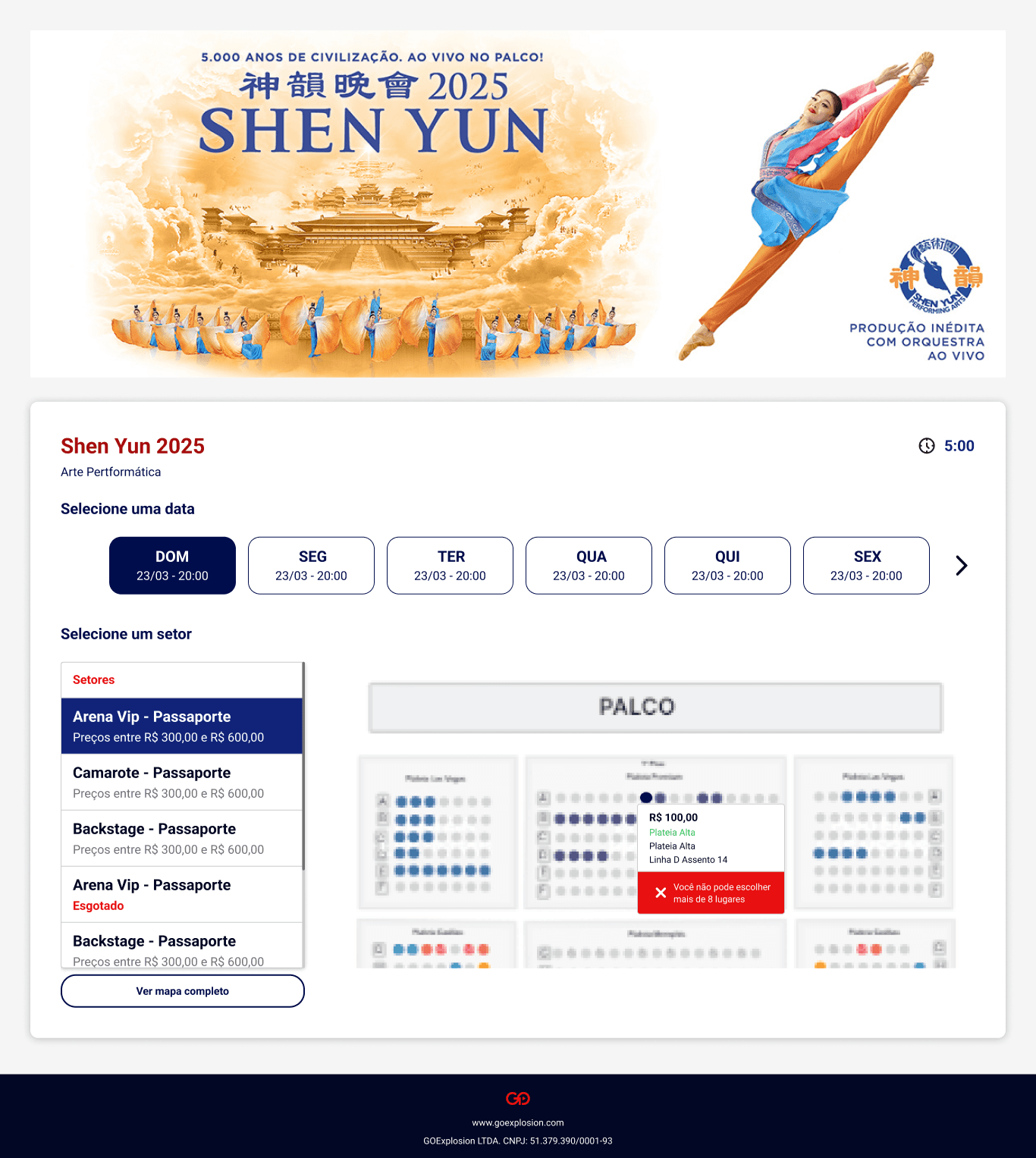
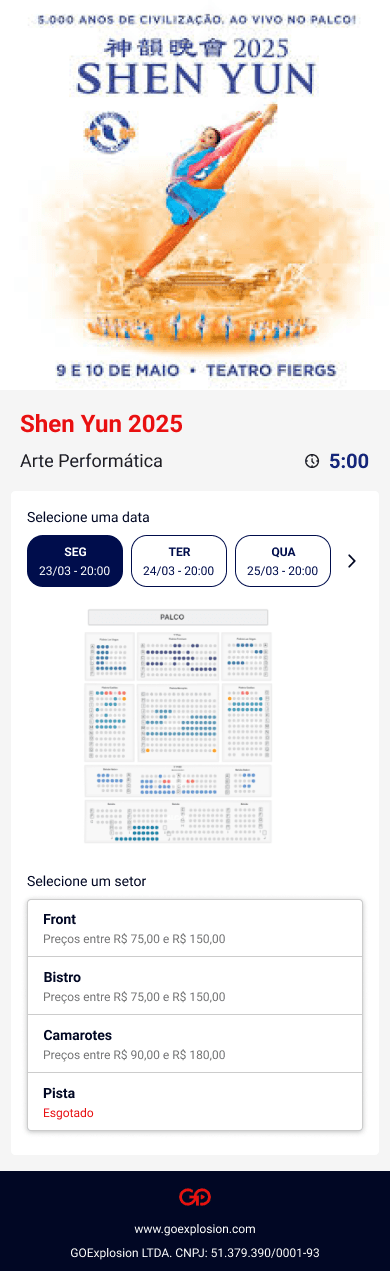
On the buyer side, the challenge was turning a multi-step purchase decision into a clear flow. Buyers needed to select a date, choose a ticket type, pick a seat, review the selected ticket, and complete checkout without losing context. The experience was designed to make each step feel connected, helping users move from interest to purchase with more confidence across web and mobile.
Mobile forced one real adaptation: the web version revealed seat and sector information on hover, which does not exist on touch. On mobile, that information moved to a tap-to-reveal pattern the buyer can dismiss, preserving the function without forcing a desktop behavior onto a different platform.
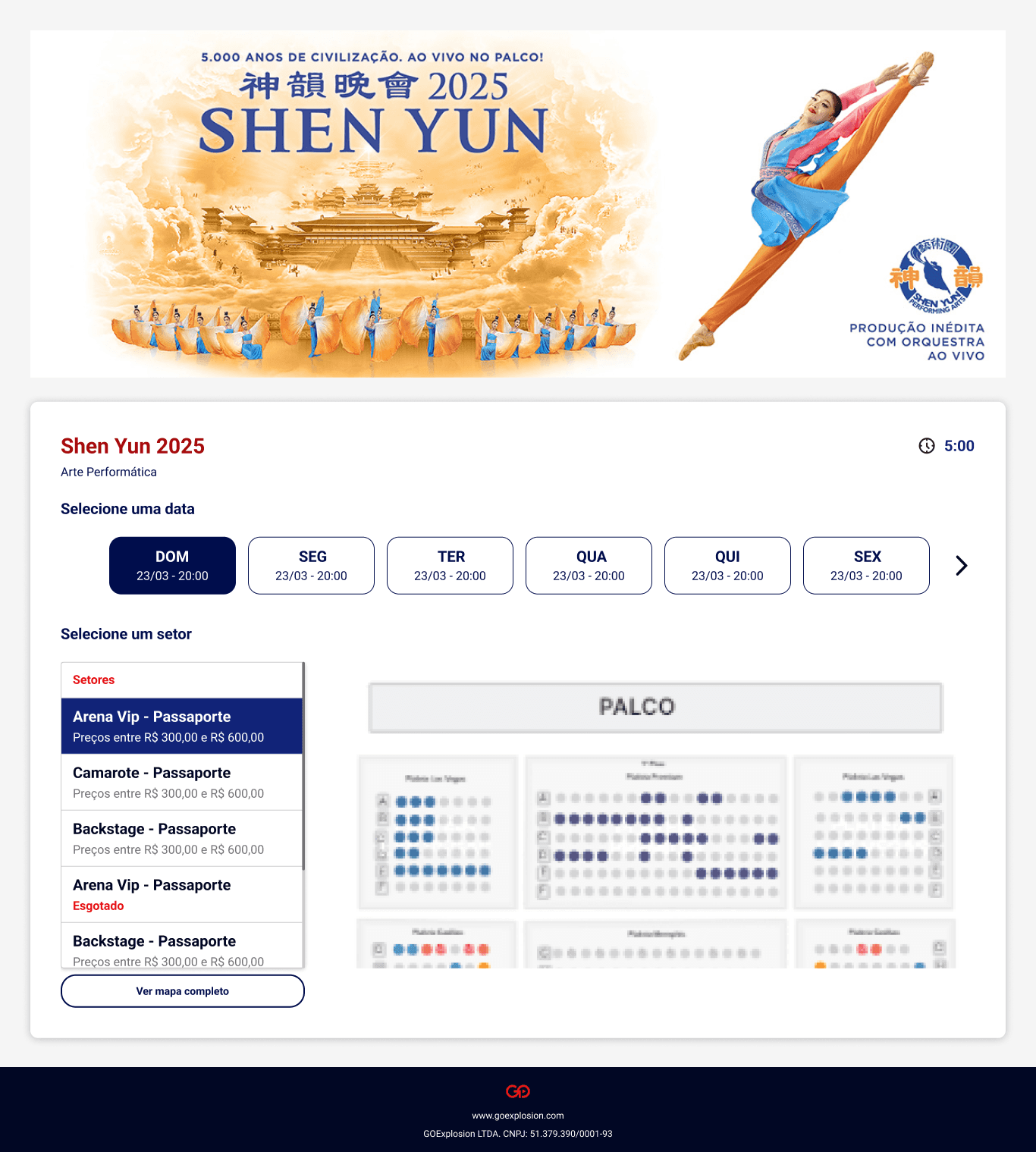
FIG. 5
Seat Selection
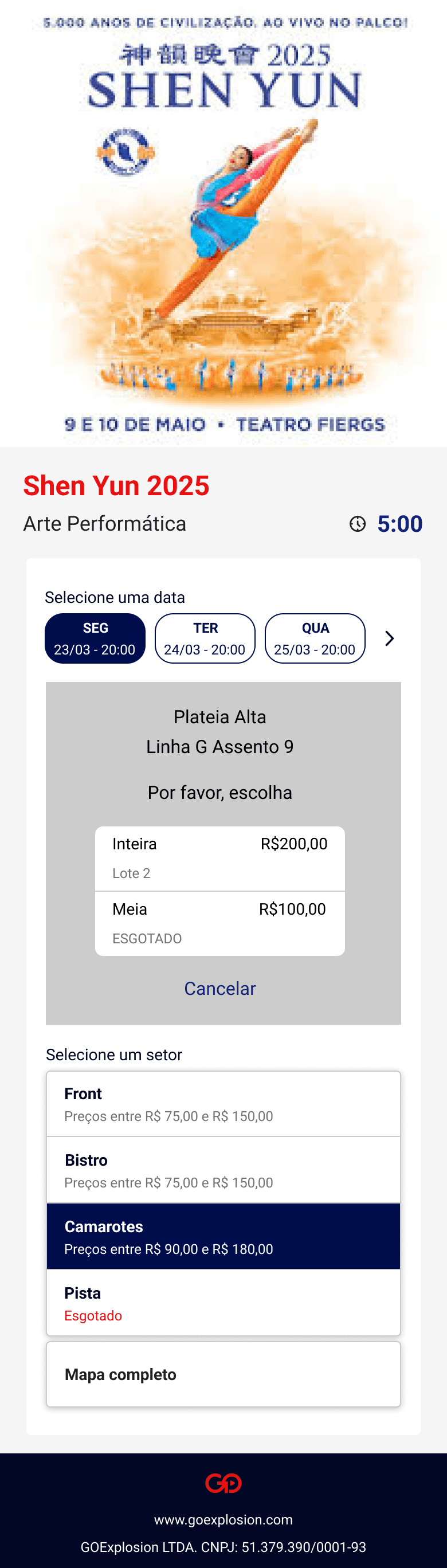
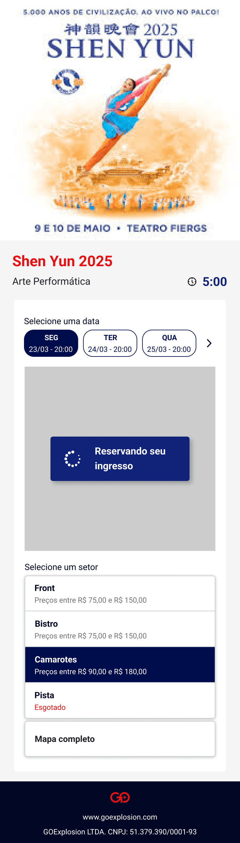
FIG. 6 & 7
Ticket type selection after choosing a seat
Clear event information
Easier ticket and seat selection
Smoother checkout flow
REFLECTION
Lessons from this project
What worked
Breaking the event experience into a clear sequence helped turn a complex setup into something creators could manage step by step. Mapping the business rules, technical constraints, and buyer journey before designing the final screens made the solution much easier to structure.
What I'd improve
Looking back, I would test the seat selection and ticket setup flow with more types of creators earlier in the process. Because the feature had many possible configurations, more validation could have helped identify edge cases before implementation.
Key lesson
This project reinforced that simplifying a complex product does not mean reducing its power. The real challenge is creating enough structure so users can manage complexity without feeling overwhelmed.
“This project stayed with me because it wasn't just about designing screens. It was about understanding a booking system deeply enough to make it feel simple for the people selling and buying through it.”
Impact
What changed
New revenue stream
Opened event-based monetization, reaching record platform sales after launch.
Validated before rollout
The company sold its own events on the new flow before releasing it to creators.
Connected seat logic
Linked seat maps with tickets, pricing, and availability.
End-to-end experience
Connected creator setup with a clearer buyer purchase journey.
role
Lead Product Designer
timeline
~4 months
team
12-person team
(Design, Front-end,
Back-end, Product, QA)
tools
Figma, FigJam, Seats.IO
platform
B2B2C Web/Mobile Platform
CASE STUDY 01
Simplifying Event Creation and Seat Selection for Digital Creators
Designing a new event experience across web and mobile that opened a new monetization channel for the platform while simplifying complex setup, ticketing, and seat selection flows.
Macbook Pro Mockup
iPhone
Mockup
© 2026 Albertine Felipe
The PROBLEM
Understanding the challenge
Creating events was more than a simple form. The experience needed to support ticket rules, pricing options, seat selection, availability, and buyer access while still feeling simple for creators to use.
To make sense of that complexity, I first mapped the main rules and flows behind event creation. This helped turn a large product opportunity into a clearer structure before moving into interface design.
The real challenge was reducing complexity without removing flexibility.
FIG. 1
Initial discovery and flow mapping used to understand the event creation logic.
PROCESS
How we got there
The process focused on adapting the existing event flow, understanding the seats.io integration, and structuring complex event rules into a clearer experience.
01
Adapting the Existing Event Flow
The platform already had a flow for creating standard events, which I had previously designed. I started by reviewing that structure and identifying what needed to change to support events with seat selection, ticket rules, pricing, and availability. Benchmarking similar products also helped me understand common patterns and opportunities to simplify the experience.
FIG. 2
Existing flow review and benchmarking.
02
Understanding the seats.io Integration
Because the seat map would be created and managed through the seats.io API, I needed to understand how the tool worked, what was technically possible, and how its limitations would affect the user experience. This helped shape a flow that was both usable for creators and realistic to implement.
The first step was defining which parts of the experience each system would own:
.
Define availability and pricing (goexplosion)
.
Buyer selects seat during checkout (goexplosion)
.
Create seat map (seats.io)
.
Connect map to ticket types (seats.io)
FIG. 3
Seats.io integration logic.
03
Structuring the Creation Flow
After understanding the business rules, benchmarks, and technical constraints, I organized the experience into clear steps so creators could configure complex event details progressively instead of dealing with everything at once.
Each step owned one decision and worked independently of event type. That independence was deliberate: when seat selection arrived later, it entered as its own step without forcing changes to the existing flow.
FIG. 4
Organizing complex setup rules into a clearer creation flow
The Solution
What we shipped
We designed a new event creation experience that turned a complex business opportunity into a structured product flow. The solution connected event setup, seat selection, ticket rules, pricing, and the buyer experience into one coherent journey.
01
Creating Complex Events Without Overwhelming Creators
The event creation flow was organized progressively so creators could configure advanced event details without facing every decision at once. Instead of treating the setup like a long form, the experience guided users through the right sequence of decisions.
The hardest call in this step was seat map creation. Technically, creators could have built their own maps, but combining map creation with ticket rules was too much complexity for a task that has always belonged to specialized teams. I chose to offer pre-built maps and route custom requests through support, trading creator autonomy for reliability at the moment of sale.
Guided event setup
Progressive configuration
Lower setup complexity
02
Connecting Map Selection to the Event Setup
Choosing a map was only the beginning. Each map carried its own sectors and capacities, and those needed to connect with ticket types, batches, pricing, and availability rules. The design challenge was making those relationships visible so creators understood what each choice meant for their event.
Map selection connected to tickets
Clearer seat availability logic
Better control over event setup
To make the setup easier to understand, I broke down how each part of the selected map would behave inside the event flow. The seat map was not just a visual choice: it needed to connect with ticket types, batches, sales periods, free ticket options, and availability rules.
This helped clarify what creators needed to configure and how those decisions would affect the buyer experience later.
Add new ticket
Duplicate ticket info
Duplicate Bacth Info
Batch Price
New batch
Sales period
Batch Name
Info Map Selection
Ticket Name
03
Managing Tickets, Lots, and Pricing Rules
Ticket and pricing management needed to support different event strategies without making the setup confusing. I organized ticket types, lots, pricing, sales periods, and availability rules into a clearer structure so creators could manage how each event would be sold.
Batch Selling Period
Batch Selling Info
Batches
Ticket Types
Edit Tickets and Batches
Organized ticket management
Flexible pricing setup
Clear sales period control
04
Creating a Clearer Path to Purchase
On the buyer side, the challenge was turning a multi-step purchase decision into a clear flow. Buyers needed to select a date, choose a ticket type, pick a seat, review the selected ticket, and complete checkout without losing context. The experience was designed to make each step feel connected, helping users move from interest to purchase with more confidence across web and mobile.
Mobile forced one real adaptation: the web version revealed seat and sector information on hover, which does not exist on touch. On mobile, that information moved to a tap-to-reveal pattern the buyer can dismiss, preserving the function without forcing a desktop behavior onto a different platform.
FIG. 5
Seat Selection
FIG. 6 & 7
Ticket type selection after choosing a seat
Clear event information
Easier ticket and seat selection
Smoother checkout flow
REFLECTION
Lessons from this project
What worked
Breaking the event experience into a clear sequence helped turn a complex setup into something creators could manage step by step. Mapping the business rules, technical constraints, and buyer journey before designing the final screens made the solution much easier to structure.
What I'd improve
Looking back, I would test the seat selection and ticket setup flow with more types of creators earlier in the process. Because the feature had many possible configurations, more validation could have helped identify edge cases before implementation.
Key lesson
This project reinforced that simplifying a complex product does not mean reducing its power. The real challenge is creating enough structure so users can manage complexity without feeling overwhelmed.
“This project stayed with me because it wasn't just about designing screens. It was about understanding a booking system deeply enough to make it feel simple for the people selling and buying through it.”
Impact
What changed
New revenue stream
Opened a new event-based monetization path for the platform.
Validated before rollout
The company sold its own events on the new flow before releasing it to creators.
Connected seat logic
Linked seat maps with tickets, pricing, and availability.
End-to-end experience
Connected creator setup with a clearer buyer purchase journey.
role
Lead Product Designer
timeline
~4 months
team
12-person team (Design, Front-end, Back-end, Product, QA)
tools
Figma, FigJam, Seats.IO
platform
B2B2C Web/Mobile Platform
Problem
GoExplosion needed a new product experience that allowed creators to sell events, not only digital products. The main challenge was simplifying a complex flow involving ticket setup, pricing, seat selection, and availability while still giving creators enough control to manage different event formats.
My Role
I led the UX and UI design of the event creation flow, from mapping the product logic to designing the main creator and buyer interactions. My focus was to reduce complexity, organize the setup process, and make the experience easier to understand across both sides of the platform.
Outcome
The solution introduced a new event creation experience that opened a new monetization channel for the platform, supporting events in arenas from 2,000 to 20,000 seats. It also connected creator-side configuration with a clearer buyer experience across web and mobile.
Problem
GoExplosion needed a new product experience that allowed creators to sell events, not only digital products. The main challenge was simplifying a complex flow involving ticket setup, pricing, seat selection, and availability while still giving creators enough control to manage different event formats.
My Role
I led the UX and UI design of the event creation flow, from mapping the product logic to designing the main creator and buyer interactions. My focus was to reduce complexity, organize the setup process, and make the experience easier to understand across both sides of the platform.
Outcome
The solution introduced a new event creation experience that opened a new monetization channel for the platform, supporting events in arenas from 2,000 to 20,000 seats. It also connected creator-side configuration with a clearer buyer experience across web and mobile.
The PROBLEM
Understanding the challenge
Creating events was more than a simple form. The experience needed to support ticket rules, pricing options, seat selection, availability, and buyer access while still feeling simple for creators to use.
There was also little internal precedent to lean on: the seat map would live inside the seats.io API, and nobody on the team knew yet what it would allow us to control. So before touching interface design, I mapped the main rules and flows behind event creation, turning a large product opportunity into a structure I could actually make decisions against.
The real challenge was reducing complexity without removing flexibility.
FIG. 1
Initial discovery and flow mapping used to understand the event creation logic.
PROCESS
How we got there
The process focused on adapting the existing event flow, understanding the seats.io integration, and structuring complex event rules into a clearer experience.
01
Adapting the Existing Event Flow
The platform already had a flow for creating standard events, which I had previously designed. I started by reviewing that structure and identifying what needed to change to support events with seat selection, ticket rules, pricing, and availability. Benchmarking similar products also helped me understand common patterns and opportunities to simplify the experience.
FIG. 2
Existing flow review and benchmarking.
02
Understanding the seats.io Integration
Because the seat map would be created and managed through the seats.io API, I needed to understand how the tool worked, what was technically possible, and how its limitations would affect the user experience. This helped shape a flow that was both usable for creators and realistic to implement.
The first step was defining which parts of the experience each system would own:
.
Define availability and pricing (goexplosion)
.
Buyer selects seat during checkout (goexplosion)
.
Create seat map (seats.io)
.
Connect map to ticket types (seats.io)
FIG. 3
Seats.io integration logic.
03
Structuring the Creation Flow
After understanding the business rules, benchmarks, and technical constraints, I organized the experience into clear steps so creators could configure complex event details progressively instead of dealing with everything at once.
Each step owned one decision and worked independently of event type. That independence was deliberate: when seat selection arrived later, it entered as its own step without forcing changes to the existing flow.
FIG. 4
Organizing complex setup rules into a clearer creation flow
The Solution
What we shipped
We designed a new event creation experience that turned a complex business opportunity into a structured product flow. The solution connected event setup, seat selection, ticket rules, pricing, and the buyer experience into one coherent journey.
01
Creating Complex Events Without Overwhelming Creators
The event creation flow was organized progressively so creators could configure advanced event details without facing every decision at once. Instead of treating the setup like a long form, the experience guided users through the right sequence of decisions.
The hardest call in this step was seat map creation. Technically, creators could have built their own maps, but combining map creation with ticket rules was too much complexity for a task that has always belonged to specialized teams. I chose to offer pre-built maps and route custom requests through support, trading creator autonomy for reliability at the moment of sale.
Arena selection
Guided event setup
Progressive configuration
Lower setup complexity
02
Connecting Map Selection to the Event Setup
Choosing a map was only the beginning. Each map carried its own sectors and capacities, and those needed to connect with ticket types, batches, pricing, and availability rules. The design challenge was making those relationships visible so creators understood what each choice meant for their event.
Map selection connected to tickets
Clearer seat availability logic
Better control over event setup
To make the setup easier to understand, I broke down how each part of the selected map would behave inside the event flow. The seat map was not just a visual choice: it needed to connect with ticket types, batches, sales periods, free ticket options, and availability rules.
This helped clarify what creators needed to configure and how those decisions would affect the buyer experience later.
Add new ticket
Duplicate ticket info
Duplicate Bacth Info
Batch Price
New batch
Sales period
Batch Name
Info Map Selection
Ticket Name
03
Managing Tickets, Lots, and Pricing Rules
Ticket and pricing management needed to support different event strategies without making the setup confusing. I organized ticket types, lots, pricing, sales periods, and availability rules into a clearer structure so creators could manage how each event would be sold.
Batch Selling Period
Batch Selling Info
Batches
Ticket Types
Edit Tickets and Batches
Organized ticket management
Flexible pricing setup
Clear sales period control
04
Creating a Clearer Path to Purchase
On the buyer side, the challenge was turning a multi-step purchase decision into a clear flow. Buyers needed to select a date, choose a ticket type, pick a seat, review the selected ticket, and complete checkout without losing context. The experience was designed to make each step feel connected, helping users move from interest to purchase with more confidence across web and mobile.
Mobile forced one real adaptation: the web version revealed seat and sector information on hover, which does not exist on touch. On mobile, that information moved to a tap-to-reveal pattern the buyer can dismiss, preserving the function without forcing a desktop behavior onto a different platform.
FIG. 5
Seat Selection
FIG. 6 & 7
Ticket type selection after choosing a seat
Clear event information
Easier ticket and seat selection
Smoother checkout flow
role
Lead Product Designer
timeline
~4 months
team
12-person team
(Design, Front-end,
Back-end, Product, QA)
tools
Figma, FigJam, Seats.IO
platform
B2B2C Web/Mobile Platform
CASE STUDY 01
Simplifying Event Creation and Seat Selection for Digital Creators
Designing a new event experience across web and mobile that opened a new monetization channel for the platform while simplifying complex setup, ticketing, and seat selection flows.
Macbook Pro Mockup
iPhone
Mockup
© 2026 Albertine Felipe
REFLECTION
Lessons from this project
What worked
Breaking the event experience into a clear sequence helped turn a complex setup into something creators could manage step by step. Mapping the business rules, technical constraints, and buyer journey before designing the final screens made the solution much easier to structure.
What I'd improve
Looking back, I would test the seat selection and ticket setup flow with more types of creators earlier in the process. Because the feature had many possible configurations, more validation could have helped identify edge cases before implementation.
Key lesson
This project reinforced that simplifying a complex product does not mean reducing its power. The real challenge is creating enough structure so users can manage complexity without feeling overwhelmed.
“This project stayed with me because it wasn't just about designing screens. It was about understanding a booking system deeply enough to make it feel simple for the people selling and buying through it.”
next project
Impact
What changed
New revenue stream
Opened a new event-based monetization path for the platform.
Validated before rollout
The company sold its own events on the new flow before releasing it to creators.
Connected seat logic
Linked seat maps with tickets, pricing, and availability.
End-to-end experience
Connected creator setup with a clearer buyer purchase journey.